Showing posts with label photography. Show all posts

Sunday, March 22, 2020

Having a bad day? Think of an Emperor Penguin in June

kw: book reviews, nonfiction, natural history, penguins, emperor penguins, photography, antarctica

When wildlife photographer Lindsay McCrae was offered the chance to spend a winter in Antarctica filming Emperor Penguins for the BBC series Dynasties, he was newly married. He did his best to set the stage, and soften the blow, but when he told his wife it would be eleven months, she blew up. Given time to review, nearly two weeks later she told him it would be OK, they could work it out.

In My Penguin Year: Life Among the Emperors, McCrae takes us with him on his journey to the literal end of the Earth. A BBC program on Emperor Penguins had sparked his desire to photograph wildlife when he was a pre-teen, and now his ambition, to film the next documentary on their entire courting, breeding, and chick-raising season, was to be fulfilled.

Nothing can prepare someone for a year in Antarctica. Summers are brutal; the rest of the year grades from dreadful to impossible. He and two companions were stationed at Neumayer III, a German research station that sits on stilts atop an ice shelf in Atka Bay. The station may host 60 or more researchers and support crew in the summertime, but only 12 will overwinter. The place is ideal because it is within just a couple of miles of a section of the bay that freezes over thickly and then hosts a colony of 10,000 Emperor Penguins.

The author felt under enormous pressure to capture every behavior in which the birds engage. We read a lot about his volatile feelings as the comparatively balmy late summer weather turned to alternating storms and clear, but colder and colder weather as winter approached. He and his helpers needed to wait, and wait, and wait, for the sea ice to get thick enough for them to get to the birds. Only once the authorities deemed it safe could they actually begin filming penguins. Until then, McCrae had to content himself with framing footage of other things going on, plus icebergs, other sea birds flying about, and the occasional seal.

In addition, shortly before he left for Antarctica, his wife informed him she was pregnant, and he had to cope with his feelings about that. Modern technology allowed them to talk almost daily, which is a great improvement over worrying about one's child being born halfway across the planet, waiting for the mails to arrive (at Neumayer III, there is no mail service for six months!).

They managed to get onto the ice in time to film courtship behavior, mating, and eventually, egg-laying. Once the egg is laid, a female will carry it on her feet for a day or two, and almost reluctantly transfer it to her mate's feet. Then she scoots off to the sea some thirty miles to the north, to fatten up for the hatching and the intense feeding period that follows.

This is what egg incubation looks like in the late fall. The male birds are huddled against a light blizzard at -30°C (-22°F). That's rather balmy compared to midwinter. Were footage taken during a heavier blizzard, it would be total "white screen"; visibility is less than an inch.

At -40° (where C and F scales are the same), mercury freezes, and so do you. So does some camera equipment. Then it gets colder. The men all suffered a lot from being out there with the penguins during "milder" days, where they actually had a fighting chance to live through the conditions and get safely back to the station.

One interesting bit of behavior amused me: when the wind blows strongly from one side, the huddle of 5,000 incubating males moves slowly downwind. Birds on the upwind side, when they've had enough, work their way around the huddle to the lee side. When the weather clears, they make their way back to a spot near to where they were, but one less stained by their droppings. Surprisingly, when the cold is not quite so deep, penguins in the center of the huddle may begin to show signs of distress and squawk. They are overheating—the others pull back to let them cool off!

More than sixty days after the females left, they begin to return. Some chicks will have already hatched. The rest hatch over a couple of weeks. The pairs find one another again, and once the infant bird can be safely transferred, the female takes over. The males, who have lost half their weight, scoot north to feed. Once they return, a round-robin of feeding chicks and feeding themselves ensues until the chicks are old enough for both parents to be away at once for short feeding trips.

This cuteness overload is what it is all about, to a penguin.

There is a picture very like this in the book, but a printing error made it unusable here. This one is from this website by Art Wolfe.

Not all the chicks, and not all the adults, live through the late winter and spring. At one point a gully opened up by shifting ice partly filled with snow. Penguins began going down to get out of the wind and were trapped. They and their chicks would have died there. After a day of discussions and soul-searching, the film crew intervened with shovels and made a ramp for them to escape. The rescue is documented in this video, clipped from the documentary Dynasties:Emperor, the fruit of McCrae's work. When hatching and raising season ended, in November, the filmmakers could return home. McCrae had an infant son to bond with.

This has to be my favorite natural history book this year. It documents the incredible accomplishments of McCrae and his colleagues and friends Will Lawson and Stefan Christmann. While Antarctic work is much less dangerous than it was a half century or more ago, it is still arduous, exhausting, very dangerous, and utterly chilling. One cannot wear enough gear to prevent at least a bit of frost nip or frostbite. Hats off to these blokes!

Friday, September 16, 2016

Tiphobia horei and photo testing

kw: species summaries, natural history, natural science, museums, research, photographs, photography

This post is only incidentally about Tiphobia horei E.A. Smith, 1880, and more about the process of getting good photographs and making images that are both attractive and useful. T. horei is a freshwater snail that is endemic to Lake Tanganyika, which forms a major portion of the boundary between the Democratic Republic of the Congo (called Zaire for a couple of decades) and Tanzania; it also extends to the DRC's boundaries with Zambia and Burundi. The Delaware Museum of Natural History has two lots of this species, both collected in the mid-Twentieth Century. The lot shown below consists of two shells; the other lot has but one.


This image shows six presentations, obtained thus:

  • The background for the column on the left is a black t-shirt I happen to have, though it has a giant Dupont company logo on the front.
  • The background for the column on the right is a piece of commercial black felt. Closely looking at all the original images, I decided the felt is the better choice.
  • The top pair of exposures is the normal exposure the camera's light meter indicated.
  • The second pair was taken with a -1EV setting, and the third pair with -2EV. This was to be sure I obtained exposures that didn't have washed-out highlights on the shell. I needn't have worried.

I use Gimp (GNU Image Manipulation Program; GNU is a freeware consortium), a free alternative to Photoshop. The first priority here is to stretch the contrast to get the most out of the subtle hues of the shells, and push the background to black and the white on the scale card to fully white.

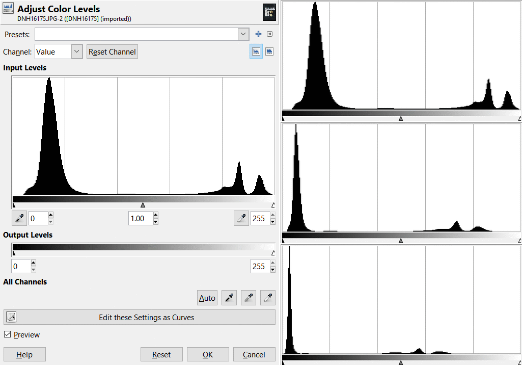
Here we have a lot of stuff in one image. On the left is the Adjust Color Levels dialog for one of the normal-exposure pictures. On the right is a crop of just its histogram, plus crops of histograms for the other two exposures. We can see how reducing the exposure just shifts all the tones toward black.

Three regions of interest appear in all three histograms. The peak on the left shows the range of dark grays from the background and the black part of the scale card. The peak at far right shows the near-white hues from the scale card. The bumpy peak near it shows the hues from the shells. The very low peak just left of center in the top histogram is from the penny. The clear separations make it easy to push the contrast as I desire. In the Levels dialog one just moves the little triangles at the bottom of the histogram to set the limits and adjust the gamma curve (which initially is 1.0). The following image is the upper right one from the montage above, just cropped to a tight square but otherwise unprocessed.


Here we can see, in addition to the shells and labels, the texture of the felt background. I used a stack of pennies to hold the tip of one shell up so the aperture is in the right orientation. By the way, the lower label indicates "40 m depth", but in the log book it says "40 mm depth". I suspect 40 meters is correct; this species is found anywhere from the surface to 100 m depth but is not common in shallow water. To obtain the next photo I set the contrast limits to 64 and 240 on the Adjust Color Levels dialog. I left the gamma at 1.0.


Now the entire background is solid black, the white of the ruler is at full brightness, and the color variations on the shells are much more distinct. Had I used a lower limit of 128 instead of 64, the pennies would also have become almost entirely black and the range of shell tones would be very strong, but it would look overdone. There is a lot to be said for working with the discriminatory powers of the human eye and brain, and not seeking to overwhelm them. For most purposes this image is a fine illustration of the shells and their labels. At times, such as for identifying shells that are more subtly similar to others, it is useful to increase the visible detail, thus I used one more processing step to emphasize the decorations and markings on the shells:


For this image I used a little bit of Unsharp Masking. It would usually not be a good idea to use this for a published illustration. The masking, a type of sharpening, emphasizes the fine details while lowering overall contrast. Unsharp Masking is one type of High Dynamic Range processing, and works even better when used with a Raw image. But a JPG image has 8 bits of color dynamic range, which comes to a 256:1 range, much greater than the typical 25:1 of a color print or magazine illustration or the 50:1 (at best) of a well made color slide. Thus we can often "pull out" details that would be lost if we just lowered the contrast overall.

Unsharp masking was developed decades ago for film processing, by astronomers who wanted to bring out details in photos of nebulas and galaxies, which have a very high contrast range. It consisted of making an out-of-focus copy of the negative, of the size you are going to make your print. That is the Mask. Then by printing through the mask, much of the large-scale dynamic range is suppressed, and the finer details are emphasized. It takes some experimentation to figure out how far out-of-focus you need to go to make the mask, and which level of contrast in the mask will appropriately render the image you want (when I was doing darkroom work I had five levels of contrast available in the printing and large-format negative films). It is time-consuming and expensive. The Unsharp Masking filter in Gimp and Photoshop and similar software emulates this process using computer code. One may tweak the controls on a dialog and see instant feedback.

As the label above also shows, these two shells were used to illustrate this species in the book "Best of Nautilus". It was a bit of an honor to handle them.

Wednesday, April 20, 2016

Polarized light photography for absolute beginners

kw: photography, photographs, polarized light, polarizers

Many years ago I had a film SLR camera, and a rotating polarizer that I could fit to the main lens. If you have a digital SLR or other camera with removable lenses, and the front of the lens is bigger than about an inch or so in diameter, the method described below won't work with that camera. But read on anyway if you like, particularly if you also have a point-and-shoot or even a superzoom camera with a smallish lens.

When light scatters it gets partially polarized. Our eyes do not distinguish polarization so we don't see these effects without a special filter. One kind of scattering is off a shiny, or somewhat shiny, surface. This causes glare if the surface is not metallic; polished metal reflects light without affecting its polarization.

Light striking asphalt, for example, is polarized almost completely when the angle of the light from the vertical is about 50-55°. Light reflecting off auto paint is also polarized, not quite so much, and at slightly larger angles. This is why polarized sunglasses help you see to drive safely in sunny conditions. When you are driving into the sun, much of the light reflected off the road and your car, and other cars, is polarized horizontally, so such sunglasses have vertical polarization and block the horizontally polarized glare.

Light scattered by air molecules is also polarized. Not completely, but about 80% as these pictures show. The greatest polarization is at 90° from the sun, which is about perfect for photos like these. Instead of a special-purpose polarizer I used my polarized sunglasses. The camera can focus right through the lens.

With the sun behind and above me I could shoot at a high angle into the Dogwood tree. The upper photo was  taken without the polarizer and shows the relative brightness of the flowers and the sky to ordinary vision. The second was taken with crossed polarization, so most of the light was blocked. This makes the sky look quite a bit darker. The third was taken with the polarization direction of the sunglass lens parallel to the sky light's direction, and shows the sky looking brighter than in the first picture. This is because the polarizer blocks half the light from the flowers, but lets most of the vertically polarized sky light through.

This trio of pictures, in the same order, shows apple blossoms and young leaves against a similar patch of sky. It produces quite lovely effects, and gives you flexibility to adjust the relative contrast of foreground objects and the sky.

A polarizer can make a partly cloudy sky look lots more dramatic, by darkening the sky around the clouds. A deeper blue sky just looks better for many kinds of landscape photography, and also for some kinds of portrait photography.

The tricky part about using this technique is to hold the camera and press the shutter with the right hand while holding the sunglasses with the other. This is why folks with a DSLR or other camera with a lens that accepts filters will spend $30-$70 for a rotating polarizing filter.

This is more of a "life hack" method for cheapskates like me! And it is a way to learn how polarization works before shelling out for a special filter.

Wednesday, September 12, 2012

Pushing my small camera's limits

kw: photography, photographs, techniques

 This morning I happened to awake quite early, so I was heading for my car prior to sunrise. Looking over my shoulder, I saw the Moon near Venus. I grabbed the camera I always carry in my lunch bag, and snapped this, zoomed all the way out (3X). I could see that, handheld with a 1/6-sec exposure, it was rather blurry. Also, the camera had focused on the leaves, which while still blurry are sharper than the Moon.


It took me a couple of minutes to run back inside and grab my mini-tripod, and then to back my car up so I could use it for a base. I took another shot with the leaves in the frame, and finally this one for which the camera focused on the Moon. Much better. There is just one thing missing in this shot, that does show up in the first one: Earthshine is just barely visible in the upper image. In the few minutes between the images, the sky brightened to the point that it swamped the Earthshine. This exposure was 1/15 second, so the sky brightness had more than doubled.

I'll have to await another occasion that I can get a sharp picture of the Moon with Earthshine. Getting Venus in the same frame is probably not in the cards. The residual blurriness in the second image is primarily due to the inexpensive optics in the Canon SD1200. Both images are 1080x720 pixel clips out of 10Mpx frames (7.8% of the frame).

Monday, January 09, 2012

Screech owl or barn owl, take your pick

kw: book reviews, nonfiction, birds, natural history, photography

This barn owl was photographed in Surrey, England by Peter Trimming; the photo is available in Wikimedia Commons.

I have seen only one owl in the wild, and it wasn't a barn owl, AKA screech owl. I have heard them, and they make quite unearthly shrieks, not at all like the gentle "Hoo" sound of other owls. Therefore, I took great pleasure in reading and viewing Barn Owl by David Chandler, with its many pictures taken by Nigel Blake.

The book is a small volume (127 pages, including index), though the pages are largeish (18.5x24.5 cm), and half the space is photos, which places it in a genre I call "small coffee-table". It is thus a quick read, but very informative. Each chapter covers a different phase of owl life or natural history.

The most significant thing I didn't know before was that over half the area that harbors barn owls, there is a single species, Tyto alba (shown above in its whitest phase). This species is the only one in North America and most of Europe, but more than a dozen other species populate areas throughout the rest of the world. Some species are locally called grass owls for their habit of nesting on the ground in tall grass. T. alba nests in cavities, usually rather high off the ground, 2-3 meters or higher. Nooks in barns and other outbuildings are thus ideal, thus leading to the common name.

All owls are predators, and barn owls are perhaps the most efficient. A pair with growing young might take 30-100 small mammals daily! That's a lot of field mice, voles, and shrews (and some rats) that would overrun us if not for owls. One owl can hunt down about ten times as many mice as the hungriest house cat.

Barn owls cough up bone-and-hair-laden pellets, as many other owls do, which makes it rather simple to determine their eating habits. Interestingly, it has been said that, if the owl's hunting range is marshy, it may take a lot of frogs, and a pellet of frog remains looks more like a golf ball than like the cigar-shaped pellet formed of small mammal remains.

Quick as the read was, it was a great pleasure to read this book, and an even greater pleasure just looking through the pictures. It appears to be pitched to ages from late middle school through high school.

Thursday, April 28, 2011

Sight with other eyes

kw: photography, astronomy, color vision

Image: NGC6744, a galaxy much like the Milky Way, 30 million light-years away, in an RGB image color balanced to look like it does visually.

Many years ago I used to wonder what it would be like to see with eyes that perceived color differently. Of course, sight is more than a mechanical phenomenon. The human (primate) retina is a carpet of well-mixed "red" and "green" receptors that overlap greatly in their wavelength sensitivity, and a scattering of less than ten percent "blue" receptors that have very little overlap with either of the others (though "red" has a secondary peak at blue wavelengths). The visual center in the brain boosts the blue signal to be on a par with the other two, while constantly adjusting so in most lighting situations the incident light seems "white".

We see with other eyes when we make a color photograph, because the filters in the film or digital sensor strictly separate red from green from blue, and print or display narrow-band signals that stimulate the color receptors in our eyes separately. Once I understood this principle, I daydreamed about using different films and filters to make separate "R" and "G" and "B" negatives, from which I could build a color print the way very early color photography was done. When I had access to a darkroom, I did a few experiments, but with poor results; I have poor laboratory skills. Special Infrared sensitive film would produce a false color image that was shifted a little bit to longer wavelengths. That was at least usable by klutzy old me, but that was about it.

It is easier now. False color rendition of all sorts of images is common, given digital tools for producing and compositing images. This is particularly true of astronomical imaging. This view of NGC6744 is a far-infrared image with false color, wherein the wavelengths captured range from 3 to 22 microns, and are printed as if they were in the visible range of 0.4 to 0.7 microns. It was made with the WISE spacecraft, which operated from December 2009 until February this year.

At first glimpse, the galaxy looks very similar, just more "technicolor". The shape is the same, and the bright areas are similar. The most noticeable feature is the bluish-appearing central bulge; the bar seen in the RGB image does not show. Then there are five major reddish areas, and a number of smaller ones, that mark sites of active star formation. The flanking areas that are green in the IR image are blue in the RGB image, and would be bright in an ultraviolet view. They mark young stars that have blown away the dust and gas that shrouded their infancy.

My first daydreams about false color imaging were just centered on the coolness of it, an interest without a focus. Others with more practical needs made it a reality. The fields in which it is used are many, from LANDSAT earth images to the thermal imaging an "energy consultant" will use to show you how your house is wasting energy. A pair of images like those above is still thrilling to me for the sheer coolness of it.

Monday, January 17, 2011

Had we better eyes

kw: astronomy, photography, atlases

For many years I have dreamed about making a photographic sky atlas. This desire was sparked when I worked at California Institute of Technology (in the machine shop), where one day I was allowed to peruse their copy of the plates from the Palomar Sky Survey. Those plates from the POSS-I Survey, numbered 1,874. Half were "blue" plates and half were "red" of the identical areas. Each plate is roughly six degrees square on the sky.

Not wishing to expose (and pay for) more than 25 rolls of color film, I had the idea of making exposures that would approximate naked-eye views of the sky, but exposed so as to "see" with ten and 100 times the sensitivity of an ordinary eye. Using ISO 1600 film, that would have been 12 seconds and two minutes, ignoring reciprocity failure, or about twice that long to account for it. My scheme would have resulted in a set of about seventy exposures (less than three film rolls) to cover the northern sky and that portion of the southern sky visible from North America.

Time has always been the most deciding factor with me. I would need three or four observing sessions of several nights each, spaced around the year, from a dark location such as the top of a mountain in Colorado. In more recent years, now that digital photography is the norm, I realized that processing costs were now nearly zero, though printing was much the same if I wanted a "book" format. But I couldn't free up the time to go shoot the exposures.

Even more recently, the project has become moot. The successors to POSS-I, completed in the 1980s and 1990s, have been digitized into the Digital Sky Survey and incorporated into the "Sky" section of Google Earth. When you are looking at Google Sky, a notice at the bottom of the screen shows a credit line. Most of the sky is credited "© 2007 DSS Consortium". Some areas of the sky are instead credited to SDSS, the Sloan survey, and a few small bits to STSCI, which holds the images from the Hubble Space Telescope.

To see how closely I can realize my dream without shooting any film at all, I took a look at a portion of the sky near Orion, centered on the Rosette Nebula:

This image approximates a POSS-I plate pair, combined and colorized. It is about six degrees across. The nebula, which contains the open cluster NGC 2244, is one degree across, or twice as wide as the full moon. It would be a stupendous sight were it bright enough to see without the amplification provided by photography, film or digital. A six degree field of vision is about what you see with 7x to 10x binoculars. However, the next image is more representative of what such binoculars would show you from a really dark location:

The eye just doesn't have the sensitivity to see more than the brightest bits of such a nebula, though a number of stars would be more visible than what is seen here. I reckon this image is probably a bit optimistic. The Rosette Nebula, as large as it is, wasn't named until it had been found photographically. It is dimmer than the great Orion nebula, the central portion of which is quite distinct when seen with binoculars.

On the other hand, adjusting the brightness of the image upward, we see what would show if the DSS had used a deeper baseline and higher gamma. With just a doubling of effective exposure, a myriad of faint background stars can be seen, and the nebula's details are even more distinct. If we could see this well, though, the sky would be rather confusing. Too much to see!

Wednesday, November 24, 2010

Not just picnic pests

kw: book reviews, nonfiction, memoirs, animals, social insects, photography

Ants! They outweigh us. There is at least one of their colonies, or societies, that outnumbers the human race by a huge factor. The renowned scientist Edward O. Wilson is but one of many scientists whose career has been devoted to them. Another is his student Mark W. Moffett, who has the added distinction of producing the best-ever photographs of insects. While Adventures Among Ants: A Global Safari With a Cast of Trillions is not quite a coffee-table book, it sports numerous photographs that I would class among the best wildlife photographs ever taken.

Look at this image of the African army ant Dorylus [the species is not stated]. Sharply focused, superbly composed, with stunning lighting, it exemplifies the genre. As the author explains in his first chapter, when he set out to study ants, one of the first books he obtained was a guide to photographing models, and he particularly studied the lighting techniques. This attention to detail earned him the attention of National Geographic editors, and he has worked with them from time to time for decades.

In this book, Dr. Moffett focuses our attention on six genera of ants: The Marauder Ant Pheidologeton diversus and related species of Asia, The African Army Ant Dorylus, the Weaver Ant Oecophylla of Africa and Australiasia, and in the New World, the Amazon Ant Polyergus, the Leafcutter Ant Atta, and the Argentine Ant Linepithema humile.

Marauder ants, a moniker the author gave them, are similar to army ants, a case of convergent evolution. A marauder colony is omnivorous, taking about equal amounts of animal prey and high-quality plant matter by raiding along a broad front supported by a network of pathways and long-established trunk lines. This species has the greatest polymorphism known, with four sizes of workers, and the largest "giant majors" are up to 800 times the weight of the smallest minor workers. Imagine a small man, say 125 pounds, working with a large brontosaur weighing 50 tons (eight times the weight of the largest elephant). Can you say Fred Flintstone?

Both Marauder ants and Army ants exhibit great polymorphism and extensive division of labor. The large workers aren't just soldiers, but do all kinds of heavier tasks. A swarm of the smallest workers typically suffices to immobilize a prey insect or small vertebrate, but it often takes a visit by media or major workers to complete the killing and dismemberment of prey into carryable pieces.

What these two kinds of raiding ants are to ground-level biomes, the Weaver ants are to the treetops. They are less polymorphic, but do have a division of labor based more on the age of the ant. Though they raid like army ants, they are also ranchers, caring for scale insects and other honeydew-producing "cattle" in some of the leafy "houses" they construct using silk from their larvae.

Almost total opposites in habit are the Amazon ants, one genus of which are the familiar "red ants" of American back yards. I call them the Lazybones ants, because they don't work. Solomon certainly did not have Amazon ants in mind when he exhorted, "Look to the ant, sluggard." The only work an Amazon ant does is to raid a nearby Formica (black ant) nest to steal the pupae. A few thousand red ants at a time will go out in late afternoon and raid a Formica nest. The black ants put up little resistance besides blocking the anthill entrances. Once the red ants break in, the black ants let the raid proceed. The stolen pupae are hatched in the red ant colony and raised to be slaves, by slaves already there. The red ants don't even feed themselves, and would starve if not fed by slaves.

We're back to ants that work for themselves. Probably the hardest workers are the gardening ants, the Leafcutters, such as these Atta cephalotes workers, also called Parasol ants, carrying leaf cuttings to the nest.

In the nest, leaf pieces are chewed into mulch and added to a fungus garden, which small workers tend assiduously, cleaning out competing fungi and killing encroaching pests, except for a few species that employ chemical camouflage, which is a problem that most ant colonies encounter. These little agriculturalists have been perfecting their farming techniques for fifty million years. The relative efficiency of genetic versus cultural evolution is thus starkly shown: most of the progress they made over those millions of years was raced through by humans in about eight thousand years.

Hey! Any conspiracy theorists reading this? How's this for a global conspiracy? There is a supercolony of Argentine ants called the Very Large Colony that covers much of the state of California, and bids fair to spread nationwide. These little gray "sugar ants" (a frequent visitor to the American kitchen) number in the trillions and are the largest superorganisms known. Where the Argentine ant has invaded America, most other ant species are in decline or have been wiped out. The only ant that typically holds its own against them is the Fire ant. Get this: Fire ants also hail from Argentina.

Argentina is a breeding ground for super-ants. When a colony of any ant species from Argentina gets started in a North American (or European—watch out, you guys!) yard, it is like dropping the Phillies among the Little Leagues. Nobody else is gonna win any games. Argentine ants, in particular, are accustomed to constant warfare, are super-aggressive, and even though the workers are all quite small, they are fearless and stupendously numerous and simply swamp an enemy out of existence.

Both Argentine and Fire ants have multiple hills and multiple queens over the area dominated by one swarm. Dr. Moffett makes a good case that each swarm is a single species, so that there are four species/supercolonies known in California, and a handful around the rest of North America. They are reproductively isolated because they kill any ant that "smells wrong", including flying-in drones that might provide genetic mixing. The borders between colonies are no-mans(ants)-lands that host constant wars. If you happen to live in Escondido, for example, and live in just the wrong place, your yard is a battleground, always littered with dead ants.

In a closing chapter, the author muses on three ways of thinking about an ant society: as a society, as an organism, and as a mind. As to the latter point, though it seems a stretch, the way a group of ants milling about reach "decisions" related to food, or nesting places, or where to go, bears quite a resemblance to the way neurons in an animal brain are thought to reach decisions. Whereas the neurons in a human brain communicate over small distances at speeds of about 66 m/s (150 mph), ants communicate at their walking/running rates of about a meter per minute. Yet the number of neurons available for ant thought in a large colony easily exceed the neurons in a human brain. Like the mills of the gods, ant thinking must be very slow, but exceedingly detailed.

Just six species, of the 12,000 or more that are known! There is so much yet to learn, and one lifetime is so, so short. A book like this is the best reason for the existence of books.

Saturday, May 08, 2010

Windy sunset

kw: photographs, photography, nature

The nice thing about wind at sunset is that the clouds move, so the view changes frequently. The trouble with wind at sunset is that the clouds move, which causes jitter in HDR images. I'll be teaching photography classes this Summer, and there is always demand for learning special techniques such as HDR. Sunsets are good for that, and I knew a cloudy, windy day would probably have a nice sunset. I popped over to a wildlife refuge in New Castle County to see if I could get a few example image sets.

By the way, HDR, for High Dynamic Range, ought to be called CDR, for Compressed Dynamic Range, because that is actually what you are doing. You are bringing in the washed-out highlights and the blacked-out lowlights to show more of the details the eye can see better than a one-image camera can. The software I use is EasyHDR Basic (the free version). My camera can exposure compensate beyond the +2EV/-2EV limit of most cameras, so I tried one image with five exposures (-3EV, -1.3EV, 0, +1.7EV, +3EV) and the software did its thing just fine. I won't be showing that here, though, but two of the 3-image (-2,0,+2) sets and singles for comparison.

Early on, just after the Sun moved behind the bar of clouds near the horizon, I shot a series that included this, which the camera tells me is its best exposure. One has to peer closely to see any detail in the nearly black foreground, and the reddish area below the clouds is washed out.

I optimized this HDR image to emphasize the sky colors, so the foreground is still rather dark. However, the red area below the clouds shows up much better. Note that the clouds look "stuttery" compared to the first image. That is due to cloud motion between shots. The wind was 40+mph at ground level; there's no telling how fast the clouds were moving!

Here is a zoomed-in image, a single again, with the Sun just peeking through the trees. The light meter in the camera was pointed at the sky above the clouds. I like this image. Let's see if HDR can do better.

This is closer to what I could see, though still not quite what I'd like. The red area is very nice, more balanced, and the sky looks good. It is pretty hard to get the foreground to show anything. The car in this image was in just one of the images used for this composite.

OK, one more bit of tinkering. I cropped a chunk out of the middle of the prior image and boosted the lowlights a little with the "brighten" function in Irfanview. There is little detail in the clouds, so the image still lacks something. It might benefit from a heavy dose of Unsharp Masking, which Gimp can do (also Photoshop, but Gimp is free), but at this point, it is probably better to await the next pretty sunset.

Tuesday, January 05, 2010

Gigapixel cautions

kw: photographs, photography, musings

Gigapixel photography has caught my interest, but not to the point of buying any equipment. However, I have been enjoying the stunning results that can be found on the web. At the moment (and this may change), when you visit gigapan.org, you see one of several huge images and have the chance to zoom and pan through it.

One is a very wide-angle view of President Obama's inauguration, from which these three clips were taken. This first is without any panning, just a crop from an image that nearly filled my screen (and I have a big one). With only a little zooming, you can pan around and see everything that the unaided eye would see.

Before taking these clips, I zoomed on the orchestra below the President's podium and found I could not read the music, but I could tell there is something on the pages.

This shows what you would see if you had been there, assuming normal vision. It is about a 6x zoom compared to the prior image.

Gigapixel images are produced by several kinds of equipment, but they all boil down to a special robotic mount (such as the Gigapan Epic) on a tripod that moves the camera in a pattern, taking an exposure at every step. A typical set is 150 images.

Companion software stitches all the images together into one big one. Rather than use edge matching as conventional stitching programs do, this software uses knowledge of the pattern followed by the robotic mount.

It can take ten minutes or more for the whole set of images to be taken. Things can move, which is why conventional stitching software can't be used. I have seen some amusing things, like a picture in which a person turned around between "passes", and it looks like his torso is on his legs backwards.

This image, zoomed as far as the resolution allows, shows what you'd have needed binoculars to see. It is about a 20x zoom compared to the first image of these three. For comparison with an image near the end of this post, note the smoothness of the tones.

When I first began following this subject, there was a website for "the Gigapixl Project" at www.gigapixl.org. They are apparently defunct. This is too bad, because they were the source of a few dozen images being presented by Google Earth. I tried contacting them, and the web site is gone; I wanted to tell them some of the things I outline below.

For now, a good resource for gigapixel expertise is the Microsoft Research HD View site. There are a number of high-quality gigapixel images one may view. The HD View software could well become the standard for viewing huge images.

To see the ultra-resolution images Google has made available, make sure you have the latest version of Google Earth, then open its Gallery section (lower left panel) and click as shown here.

There are getting to be so many layers in Google Earth that I have trouble remembering where everything is. Fortunately this panel is easy to use.

Note that the "e" is missing; these photos are specifically from the Gigapixl Project, when it existed. I hope Google is now securing such images from other sources.

With "Gigapixl Photos" checked, you'll see a camera icon wherever a giant image (or a few) occurs, whenever your "Eye Altitude" is less than 3,000 miles/5,000 km. Here, I have hovered the cursor atop one and the title "Devil's Tower" appears. Clicking on it opens a dialog showing a small image and an invitation to "fly" into it.

I particularly like what happens next. The gigapixel image is overlaid with the landscape, appropriately tilted so that you seem to be looking "through" it.

This crop was cut from the "window" before doing any zooming. I am going to pay attention to the shrubbery just visible on the lower right flank of the tower.

In the upper right corner are zoom and pan controls. I double-click to zoom in, use the mouse wheel to zoom out, and click-drag to pan…usually. Double-click on any area of the image to center that spot and zoom by a factor of 2-3.

Zooming in by double-clicking is more stable than using the mouse wheel; one step on the wheel turns into a whole lot of zoom. I suppose I can change that, but I haven't yet investigated it. So I double-click.

Two such steps yields about a 8x zoom, and the view as shown in the second photo of this series. I am going to focus on the small tree right at the center of this image.

Before we go on, though, note the clarity and smoothness of the image at this point. A well-taken gigapixel image will look equally good until it runs out of resolution.

And here, with another pair of double-clicks—another 6x of zoom (total about 50x)—we are clearly beyond the resolution available. 20-25x is the normal limit of resolution for a 1-1.5 Gpx image. At 50x zoom the "graininess" of the image becomes very evident. Even at 25x, where the image looks good and sharp, the sky and rocks have a grainy appearance.

This is the cause: Shooting at an ISO setting that is too high. Recall how smooth the tones are in the picture of President Obama in the third image above. Digital photography has the potential for making images that are smoother than anything film could produce, but one must use the lowest ISO setting of the camera to achieve the best "look". For most point-and-shoot cameras, that's ISO 50 or 60, and for DSLR's it is ISO 100 or 200.

This image must have been made with ISO 400. It just didn't capture enough light in each pixel to reduce statistical noise to an invisible level. Remember, point-and-shoot cameras have a sensor with pixels only about 1.5 microns square. You have to capture 10,000 photons per pixel to have a noise figure less than 3%. The noise figure above is about 10%.

I have viewed nearly all the gigapixel images Google Earth has on display, and they all have this problem. So to anyone contemplating going for ultra-size imaging: use the lowest ISO. It takes the robotic mounting a couple seconds to move the camera to each step. Whether the shutter speed is 1/100 sec or 1/4 sec will have little impact on the time it takes to gather the images, but it will have a great impact on the quality of the finished image.

Now for a side note. While looking for the Gigapixl Project, I came across the Gigapixel Project (note the "e") at Virginia Tech's Center for Human Computer Interaction. This shows a 50-panel touch screen they have recently built. They are on the way to a Gpx display; this one is probably about 120 Mpx total.

The sharpest displays are 100 dpi; a billion of those comprise 100,000 in², or 64.5 m². That would be a wall 5.7m high and 11.4m long, or something similar. Don't hold your breath for an economical home system…

Monday, January 04, 2010

It can take a lot more pixels than you think

kw: photography, techniques, software

Photography, like realistic painting, is the art of getting onto paper some facsimile of what the eye sees. Until you try to get "all" aspects of a scene to match what you could see, it is hard to realize just how powerful human vision can be. While our vision system is only in sharp focus over a rather small area—a few degrees wide—we rapidly scan that focus over a scene and our memory stitches it together into a comprehensive view. Reproducing a single still image with that comprehensive view is a challenge. In the discussion below, I'll mention software that increases the areal extent of a digitally imaged scene (panorama stitchers), that increases the apparent dynamic range (HDR programs), and that allows the display of extreme depth of field (focal stitchers).

Firstly, we can swivel our focus over ±70° right and left and ±50° up and down, without moving our head, and we routinely scan an angular field that covers about a tenth of the maximum area, perhaps a thousand or so square degrees. Average resolution in the visual center is about 1/60 degree, so 60x60 is 3,600 pixels per square degree. That doesn't seem like too much: about 3.6 Megapixels (Mpx). A photo that covers a 39°x26° span with 60 pixels per degree just matches what we "usually see", discounting peripheral vision.

A quick swivel of the head, though, allows us to gather a much wider span, and we tend to remember the whole panorama as a unit. The more we gaze, the more we see, and we frequently remember a "sight" that covered 150°x60°, containing 30 Mpx or more.

For generations, photographers have used scissors-and-paste methods or darkroom techniques to put together panoramas that covered all of a scene. These days, software can do this for us. I remember the awe I felt when first I stitched a scene together. I used the "Make Panoramic Photo" option in Windows Live Photo Gallery (there is a link to download it here).

There is also a Photo Stitcher program that comes with any Canon camera, and there is an app for an Iphone, which was used to make the montage shown here. (All the images in this post are shown rather small; click on any of them to see a larger version). This montage shows, at the top, two of at least four images used to make the raw stitch shown at the bottom. One would normally crop out a rectangle to your taste from the rather blobby stitched image.

The Canon software has some hand controls available, and requires hand work if your collection of images don't follow a single "straight line". I've used the Windows Live tool to stitch as many as nine photos in a 3x3 matrix, and as many as ten that were in a line, which it did without further input from me beyond choosing the images I wanted stitched. You just need plenty of overlap, 20% or so in each direction.

You can also get large panoramas from a costly fisheye lens on a high-dollar camera with 20+ Mpx camera such as the Nikon D3X. Stitching is cheaper. So this helps us catch a scene as big as the eye can see.

Then, there's the dynamic range conundrum. Film photography helped us out by recording dynamic ranges of up to 1000:1 in a good negative, and we could use print paper with various amounts of contrast to reduce any or all of this range to the 50:1 range that can be reproduced on a good print. 1000:1 is ten f-stops (actually, 10 stops is 1024:1). But the eye can see, in any glance, a range of more than 15,000:1, perhaps fourteen stops. And when we look for a moment into a brighter or darker part of the scene, the eye quickly adjusts over another five or six stops (~50:1) to allow us to see details nearly everywhere.

In this image, the eye sees at least as much as is shown in the left panel, while a "normally exposed" single digital image is stuck with that on the right, which has a dynamic range of no more than 256:1; and actually, since digital is a linear medium, some of the range is wasted, and we don't see all 256 shades, but more like about 80-100. For many scenes that is OK, but of course we often want more.

Software such as EasyHDR Basic (available free here), takes information from three or more images that were exposed at different levels, to produce one range-reduced image that looks more like what the eye could see. The common technique is to use the Bracketing method that many cameras now have in them, which exposes three times, once "normal", once two stops faster, and once two stops slower. Some cameras even will combine these in to an HDR image automatically.

Adding a total of four stops more brightness information to your scene takes a 256:1 range and expands it to 1024:1, if you are getting JPG files from your camera. If you have the ability to get RAW format files, they start with either 4,096:1 (12 bit) or 16,384:1 (16 bit), so it is better when shooting RAW (which EasyHDR can handle), to go manual and shoot at least four stops over and under for your added images in the stack you'll be using. Of course, be sure to do this using a tripod. Though the software can shift the images to overlap better, the result will lack some sharpness if you start with handheld images. I understand that qtpfsgui has better control of image offsets. Haven't tried it.

So what do we have at this point? Panorama software that can make our pictures taller and wider as needed, and HDR software that can increase the detail we see in the highlights and shadows. There is one more step (so far…).

When your eyes scan a scene, they automatically focus, so your memory of the scene is sharp everywhere, with rare exceptions. A camera's depth of field depends on two things: focal length and aperture (f/ratio). Wide-angle lenses are most forgiving; at a specific f/ratio (say, f/8), a lens of half the focal length will have twice the depth of field at mid-range, and more than that near the hyperfocal point (which is the focal distance to set so that things at "infinity" are just in focus, and a range of closer objects are also seen sharply).

There are trade-offs, however. In small cameras, such as most point-and-shoot, the pixels are so small and the lens is so small, that while there is a large focal depth, the image is slightly unsharp everywhere. When you print a 10 Mpx file on 6x4 paper, it looks good, but enlarging it past 7x5 can show up some fuzziness. In SLRs, with their much larger sensors, the lenses are also larger, and their focal lengths much longer. For example, my Nikon D40's lens has a focal range of 18-55mm; my Canon SD1200's lens has a focal range of 6.3-18.9mm.

So far so good. Because its lens is so short, the Canon's range of f/ratio is f/3.5 to f/8, and no further. The Nikon's is f/3.5 to f/32. One might think, "Great, the Nikon can take really deep-focal-range pix", and it can, but with it there is an overall fuzziness due to diffraction. Roughly speaking, the smallest spot a camera can record (in the sensor plane) is the wavelength of light used times the f/ratio; for f/32, this is 32x0.5µ, or 16µ. The sensor's pixels are 7mm apart, so a 6 Mpx image taken at f/32 has no more resolution than a "perfect" image of 1.5 Mpx, or even less. A ratio of f/11 is about as far as one can go for an image that is sharp at least somewhere!

Helicon Focus to the rescue. This software (available here) takes several images shot at different focus distances and combines the sharpest parts of each into a single image with "infinite", or at least, "extreme", depth of field. The promo photos showing the fly's head and the shotgun illustrate what is possible. It takes three to ten or more images to produce one XFD (I just made this up, for eXtreme Focal Depth) image.

Now, the eye does all this at once. What are we to do?

One reviewer noted that one piece of HDR software (he didn't say which) can also make panoramas. Presumably, you take two or more sets of your panorama images and the program both stitches and applies HDR composition to get an image like this one.

This is cool. It also takes lots and lots of images. This image alone used at least three angle settings to cover the width of the view, and at least three images of each angle setting, for nine starting images. I assume this was made at a setting similar to f/11, so there is decent focal depth.

To get real XFD in such an image, you're getting into a combinatorial explosion! At the very least, 27 images to start with, assuming you had a program that could do all three things at once!! The original image for this HDR panorama is about 2500x800 pixels, or just 2 Mpx. But it took at the very least nine 1.5 Mpx images as a starting point, and I'll bet that the original camera has 6 Mpx or better (54 Mpx or more for the progams to grind through).

To recap: A well-framed and -exposed photo with almost any modern digital camera can record most of what the eye sees over an angular area that one tends to take in "at a glance". To take in all that the eye can see over the area of a quick side-to-side scan requires lots of images. At the very least, 2x2x2, or eight, and a more likely "usual" stack of 3x3x3, or 27. There is plenty of room for improvements in photographic techniques and in the software needed to support them.

One way to sidestep the XFD situation is to use a Gigapixel method (there are several, most using robotic image capture), in which a very large image is stitched from a multitude of small images. Each can be well focused in its small area, so the result will appear to have extreme focal range. Since the Canon software can stitch together as many as 26 images (and I think the Windows Live tool is similarly capable), careful panorama planning can produce large photos that are sharp nearly everywhere. But just think, if you want to go HDR with 26 starting "pointings"; it'll take at least 78. I think the right order of processing is to make the three panoramas, then do HDR processing. The other way around, you'd likely have variations of final lightness. The mind boggles.

Friday, January 01, 2010

Rose Parade 2010

kw: national events, photographs, photography

Every year I watch at least part of the Rose Parade broadcast. When I lived in or near Pasadena, I went to the parade several times. Once I stayed up all night to secure a curbside spot. I remember the night better than the parade next day!
This shows a float from this morning's Tournament of Roses Parade broadcast, taken right off the TV screen with a 6Mpx camera. The moiré pattern, caused by the near-alignment of the camera's pixels with the TV's pixels, is rather objectionable, even though I used a heavy blurring step before reducing resolution.

I've worked in printing, and I recall that when printers must overlay several halftone screens, such as for a color photograph, they rotate the successive screens by about 25° to minimize moiré fringes. So I decided to rotate my camera.
I tilted the tripod mount somewhat less than 30° and shot pictures throughout the parade. This shows what one of them looks like. Once I'd loaded them to the computer, I could measure right off the picture in the image processing software: 23.4°.

This is the image above, rotated back and cropped. I did a blur step and reduced resolution.
This image of the two floats has only a trace of remaining moiré. You have to look for it (try clicking to get a bigger image, and search there).

Here is one more, without the blur step. The blurring inherent in reducing resolution has done a good enough job.
I just had to have one pic of the PCC color guard (I wasn't quick enough to get a shot of the band). Not only did I attend PCC for a while in the 1960s, but my mother was valedictorian of her class when she graduated from PJC (It used to be called Pasadena Junior College) in 1942.

Thursday, December 24, 2009

HDR for real

kw: photography, photographs, digital darkroom

It didn't take long; my post yesterday about "faking" HDR by various means got a quick response from one correspondent. In essence, "Try easyHDR Basic, it's free." I have to admit, it is easy to use, and the result, shown below (click for a bigger version), is definitely better. When I have only one NEF (Nikon Raw) or JPEG file, the tricks can still help, but nothing beats genuine High Dynamic Range tone mapping software.

Wednesday, December 23, 2009

Partial HDR

kw: photography, photographs, digital darkroom

Christmas lights are up, and I decided to experiment a little, to get pictures of my neighbors' displays that looked better than my past efforts. The neighbor across the street has a modest but pleasing display. The image below is reduced from the "normal" JPEG file. All images were taken using Nikon's RAW format, NEF. The images behind the ones shown, obtainable with a click, are 1/4 the original size, 752x500 pixels.

So this image shows what one usually gets from the auto-exposure setting. I forced ASA 200 for smoothness even in the shadows, used Aperture priority set to maximum (f/4.2 at the 30mm zoom lens setting), and the camera used a shutter time of 1.8 seconds. Of course I had it on a tripod.
Because of the brightness of this display, mainly the "tree balls", some light shows on the house. Many photos of Christmas lights just show the lights with little hint that there is a house holding them up! The light on the snow bank is from a street light half a block away.

I have a variety of image processing software. For the work today I used Irfanview 4.2, Nikon ViewNX 1.2, and Picasa 3.0. Both Irfanview and Picasa can work with NEF files. I don't have high-dynamic-range (HDR) software, though I do have Gimp 2.0, which is able to produce HDR images, but with lots of operations. I decided to see what I could do to get "halfway to HDR".

The image that follows shows what Irfanview can do with this default exposure, using the NEF file as a basis. To "pull in" the highlights and shadows I cut the contrast by half (a setting of -64 in a range of -127 to 127). I applied sharpening of 0.2 (20 out of 99), which brightens up any edges, and saved the result as a JPEG file using a quality factor of 95%.
One of my goals was to bring out the colors of the globes in the tree. This image shows them slightly better than the one above it, but its main visible difference is that it brought up the light on the house and a hint of light in the sky.

In case I want to try real HDR processing, I made EV+2 and EV-2 images. This is the EV+2 image. The only difference from the first one above is the exposure time, about half a second. Now you can see mainly the lights, and the globes' colors are more distinct.
I used Irfanview again to cut the contrast in half, but added this: I raised the Gamma to 1.4, which increases effective exposure.
I think the colors are better, but there is a washed-out look. The hint of light in the sky is now just a scant hint, and quite grainy also.

Then I tried something analogous in ViewNX. Being tuned to Nikon files, I hoped it would make all the dynamic range of the NEF file available to being mapped into a JPEG file. JPEG files use 8 bits per pixel, while the NEF format for a D40 has 12 bits per pixel. That adds four stops (4 factors of 2, or 16x) to the lightness range.
ViewNX gives you control of both ends of the range, using "Protect highlights" and "Protect shadows" control sliders. I set both sliders to 100%. This is getting to be a pretty good image, though the sky is still quite grainy. This is about the best one can do with a single NEF file.

I had one more trick to try. I'd read that Picasa has a "poor man's HDR", in its "Make a Collage" section. One type of collage is a multiple exposure. I tried making a triple exposure with all three images, which was overpowered by the EV-2 one (7+ seconds): the globes were glaring white. So I made one just using the "normal" and EV+2. After saving the collage image, I used the Fill Light tuning option, setting the slider to halfway, and saved a copy.
While I am still not satisfied with the look of the globes, as a whole this is the best image. It looks much closer to what I recall seeing visually than any of the unprocessed images.

Tuesday, September 29, 2009

Picturing the third dimension

kw: photography, photomicrography, new technologies

In 2000, Noel T. Goldsmith wrote "Deep Focus; a digital image processing technique to produce improved focal depth in light microscopy" (Image Anal Stereol 2000; v19; pp163-167 and this PDF). The article outlines and demonstrates how software can detect the most in-focus parts of multiple photographs of the same subject and stack them together to produce one image that is in focus throughout. It is the 'through-focus' analog of panoroma stitching.

It only took a year or two for the first commercial products to appear, and by 2003 there were several. One that seems popular is Helicon Focus. The three images that follow are from a review of Helicon Focus at Digital Photo Pro. They suffice to show the principles.

This is the first of ten images in a "stack" taken over the wide focal range of this sunflower field.

This image, the tenth in the stack, is close to what you'd get by focusing near the far end of the field, and letting the closest flowers go out of focus.

With the software, the whole field appears in focus. The original paper by Goldsmith was applied to microscopy, and that is still its most useful arena, for depth-of-field problems are the greatest there.


This image, from Concept 2 Innovation, could not be taken any other way. It is actually a stitched mosaic (panorama) of several through-focus stacks processed by Helicon Focus. Of course, this is quite a bit smaller than the research photograph, which shows great detail over and throughout the entire fly. It think of such a photo as a kind of gigapixel image with three dimensions. Producing two such images at an angular difference of 10° will yield a stereo pair of fully focused images. Heaven for a microscopist!