Showing posts with label typography. Show all posts

Monday, April 01, 2013

A face for all occasions

kw: book reviews, nonfiction, typography, type faces, fonts

I have a few methods of locating new books of interest, but I missed this one when it came out a couple of years ago: Just My Type: A Book About Fonts by Simon Garfield. Take a brief look at the book title. Why is slanty type called "Italic"? And why is the text typeface called "Roman" (though a growing number of publications use "Swiss" typefaces)? You'll find answers in Garfield's romp through the history of typeface design.

And what a romp it is! Helpfully, it starts in the middle and runs both ways through time. It would be a bit boring to just plod along the timeline from Gutenberg's Fraktur faces, what my parents called "Old German", through serifed faces based on Roman inscriptions of the Imperial period (particularly Trajan's Column, still the standard-bearer), to sans-serif faces that were more "modern" some 100 years ago. Instead, he starts by discussing what makes a typeface more or less likeable and useful.

The 22 main chapters are interspersed with 12 short chapters on individual typefaces, or groups of them (or, in one case, a very particular symbol). The first of these is the much-used but much-hated Gill Sans. Loved because it is legible, hated because Eric Gill offended nearly everybody, primarily by his Satyric tendencies.

To any who don't now, a "serif" typeface is one like Georgia, which I chose for this review. A serif is the little blip or hook such as the hangy-downs on the capital T or the feet of a capital A or small n. Fonts without these, such as Verdana, a very common Web font, are called "sans-serif", "sans" being French for "without". Also, Fraktur is a lot like Old English (look both up in Google Images; the differences appear minor until you really look), but with the extra letters needed for German typesetting. Both are also called Black Letter; they use a lot of ink on the page. Finally, a font was originally a specific style and size of a particular type face, such as "Georgia Regular 12 point" or "Headline Bold 48 point". These days, with TrueType and OpenType standards for re-sizable glyphs, a font file contains the glyph definitions for a specific style, and several files are needed to make full use of a particular typeface. Thus "Georgia" refers to a typeface, while "Georgia Bold" refers to its boldface variant. Many typefaces intended for text have four variants: Regular, Italic, Bold and Bold Italic. But many commercial fonts have 20 or 30 variants, including light, heavy, and hollow versions, plus condensed or extra-wide, even "fat".

Certain typefaces have become so widespread they seem part of the furniture. In England, for example, most road signs used a typeface named Transport, a sans-serif face using both upper and lower case. Its promoters established that a sign reading Watling 4 km is easier to comprehend at a glance than WATLING 4 KM. The Transport face is found on English language road signs around the world. This bears on a point Garfield makes repeatedly. Numerous typeface standard-bearers have stated that if you notice the typeface, it interferes with the message. Thus fancier or prettier faces are to be reserved for special uses.


Still, the number of very useful typefaces is large. This clip from Camdon Wilde's Periodic Table of Typefaces shows just a few of the 100 most popular types (at this point in time). If you're curious, #2 is Futura, also sans-serif, and #3 is Bodoni, a hugely popular serif font.

I have collected font files for my own use for many years. Though I am discriminating, still the collection numbers 1,840 files. For convenience I have them in 9 categories and 54 sub-categories. Text fonts make up a large part of the collection, with serif and sans-serif faces categorized along a wide-narrow continuum, from ultra-condensed to ultra-wide.

I also have a careful selection of decorative faces, including 200 specifically useful for initial capitals (drop caps), that I like to use to spruce up a text document.

Here is a glimpse at just a few of the 200:

Among those seen here, Goldstone and Genzsch are the most useful. The frilly ones are easier to comprehend in larger sizes. A 3-line drop cap in 12-point text is about 40 points, depending on the ledding (now spelled leading, but pronounced with a short "e", not the "ee" sound), which refers to the extra space between lines of type that improve readability.

Type design went through several stages of mechanical production, but computer design is now ubiquitous. Punch cutting is practiced only by a few gluttons for punishment. A multitude of typeface design programs makes the craft accessible to all, and the existence of more than 100,000 electronic typefaces testifies that it isn't that hard. Making a face that will last, though, that's hard. Someone I expect to make a lasting mark on typeface design is Ray Larabie, who has designed hundreds of typefaces. I have obtained several that I like very much. There are others designers who are equally prolific, something quite impossible in the days of punch cutting in metal.

The book just scratches the surface of the wonders of typefaces and their design. I seldom mention a book's bibliography, but I recommend it for those interested in the subject. There is also a fine list of useful web resources. And by all means, if you've a hankering for type design, there is plenty of freeware available. I am partial to FCP, which has a free version, but the "good" version is not too costly. Try your hand at type design. Of course your first effort will be junk, but you'll learn something. And you'll learn a lot from the book!

Monday, July 18, 2011

Long s - a victim of efficiency

kw: typography, history

During genealogical researches, I've been reading a lot of old books and letters. I got more interested in the way the long s (often shown as ⌠) was eliminated in printed versus handwritten documents. Even quite late in the 19th Century, you can see letters and manuscripts with words that look like wi⌠h (wish). Also, wi⌠e and wife used in the same document can cause a bit of cognitive dissonance, particularly when trying to read quickly!

I just had to dig into things a bit. At first, I thought it might be a linguistic trend, in other words, primarily a matter of fashion. While there were linguistic fashions involved, I realized there was a societal evolutionary trend also at work. For a great summary of the linguistic trends, see The Regency: So Long, Long S: It outlines the dropping of typographic ligatures and the long s during the Regency period. But there was a reason for this.

In printed books, the crossover occurred early, beginning in 1780 and being essentially complete by 1820. This period reflects the time it takes to wear out a set of metal type. The most popular typefaces of the very late 18th Century tended not to include the long s or any of its ligature forms, and the reasons were primarily economic. Lord Scott has written, "The Regency era bridged the gap between the old slow-paced order of the 'Georgian' 18th century and the new, faster, industrialized world of the 'Victorian' 19th" (We Make History: Regency Primer).

The watchword of the Georgian era was Manners; that of the Victorian era was Efficiency. Faster steam trains and steamboats, the growth of standardized manufacture, and particularly, continued innovations in printing technology all contributed to the "get more done more quickly" social trend.

English typography can get along quite well with 26 minuscule and 26 majuscule letters, 10 digits and about 10 punctuation marks. The long s required two more letters, and the ligatures in which it participated required at least four more minuscule letter forms. This sample of Caslon ligatures is from a modern font file. Computer font files are cheap to produce, compared to metal type, so there is growing interest in the elegance of older-looking documents using traditionalist type faces. There are seven "f" ligatures, and five with the long "s". The short s does not participate in ligatures, so dropping the long s and its ligatures sped up the process of setting type by hand. Almost simultaneously, the f ligatures were also mostly dropped.

I remember once asking why cartoon characters only have three fingers. My father, who had aspired to be a cartoonist when he was a teen, said, "If you have to draw the character a thousand times for one minute of action, skipping one finger can save you a lot of time." In the same way, dropping all those ligatures reduced the number of type pieces in a font by 15%, and if you can save 10-15% of a compositor's time, you can set the type for a novel several days sooner.

By the 1880s when practical typewriters were developed, quickly followed by the Linotype®, there was no question of having more than 26 keys for letters, though punctuation marks had grown in number to about twenty (the original Linotype® keyboard had separate keys for minuscule and majuscule letters, but no 1 or 0, using small L and large O for them). This was the death knell for retaining long s in handwritten manuscripts. You can hardly find a document written after 1880 that uses it.

Will it ever make a comeback? It could. Modern technology makes leisure pursuits more economical. The inclusion of ⌠ and its ligatures, along with the f ligatures in modern typefaces, and the inclusion of codes for them in Unicode, certainly makes it technically feasible. Perhaps one day a version of Word or another writing tool will include an option for converting s to ⌠ according to the original rules, adopted from Greek, which still uses two forms of small sigma. The nostalgia crazes among those who are now middle aged—younger baby boomers and older GenXers—could lead to whole books being published that bear a Georgian or older aspect. If it is "cool", people will do it.

Wednesday, June 08, 2011

We now have one S

kw: history, historical linguistics, typography

In the original manuscript of the Bill of Rights, the word "Congress" is seemingly spelled "Congre⌠s" or even "Congrefs" to many eyes. That funny letter before the final "S" is the "Medial S" and was used everywhere except where S was the last letter, prior to about the year 1800. There are plenty of discussions of the medial S available, and that isn't my point here anyway. Rather, it is that with the help of the Google Labs Ngram tool, we can see the change take place.

As the Google Labs people explain in their "About Ngram" information, the medial S in older documents was OCR'd to an F, so that we need to be wise when searching older documents. Here is a search for both "wish" and "wifh":

You can actually see the change take place. You can also see that the medial S seems to have arisen about 1630 but become common only after 1660. Either Google is fixing older books' renderings, or only the common S was used in the oldest books.

By making a run with "wish,wifh,desire,defire" (not shown), I found that "desire" (+"defire") has a rather steady frequency going back to 1600, but, as we see here, "wish"+"wifh" grew from a low level early on prior to 1800. Since about 1800 the two words have very similar frequencies.

Does the downslope from 1850 to 2000 indicate a reduction in wishfulness? Further study may ferret that out.

Wednesday, April 07, 2010

More on fonts that save ink

kw: observations, typography, fonts, efficiency

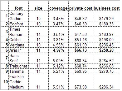
I wrote a post last October in which I compared the "ink economy" of Ecofont with some standards, and a new extra-light font. Now printer.com has done an actual study using printers with different default typefaces and face sizes, as reported by CNet.

Their results shown here indicate that Century Gothic just outdoes Ecofont. However, the effective face width differs for different fonts.

For example, while a sample of Verdana may cover 4.55% of the paper, where the same text in Arial covers 4.97%, if the two are printed at the same face size, the Verdana sample will take up more total horizontal space than the Arial sample (I am assuming the baseline-to-baseline distance is set the same for the two faces). Thus, a large work such as a book chapter might require more pages in Verdana, at the same face size. A slightly smaller percentage of a larger number of pages might or might not actually save something.

It will take some fooling around to determine to what extent this latter factor might change the economic figures shown here. Don't hold your breath, but I expect that printing a book using 10pt Verdana will cost a bit more, using more pages and more ink, than printing it using Arial. Then again, I wouldn't print a book in a Sans Serif typeface, I'd use Times New Roman, which is more economical than Verdana or Arial, on both counts.

Tuesday, October 20, 2009

Fonts and ink

kw: observations, typography, fonts, efficiency

I heard about this unique ink-saving font from a friend. As you can see, it preserves a "heavy" outline, based on the font Vera Sans, but uses "holes" to remove about 20% of the ink that would ordinarily be used to print. It is found here. At the moment, it has only a Regular version (at least in the free download), so converting a page to print using it will lose any bolding or italic emphasis.

That got me thinking. I've been collecting selected free fonts for years, so I looked through my archives. There are other ways of using less ink while maintaining a good, readable look.

While Verdana is heavily used for web pages, the slightly lighter Arial is used in many, many Windows documents for printing. It is the default in Microsoft Excel and in many PowerPoint templates, for example. However, it is still a bit of a heavyweight, with a large x-height and thick strokes.

I chose the letters e, t, and a to display because together they represent 30% of all letters used in English text. If you consider punctuation, the total proportion drops a couple of points. The caps are shown below the uncials to illustrate the normal leading (or ledding), the extra space added between the topmost ascender and lowermost descender. When Arial is used at 12 point size, default leading is 14.5 points from baseline to baseline.

Because of kerning, and variations from typeface to typeface in spacing standards, the measurements I report below are based on the ink width of the letters and include no between-letter spaces.

Times New Roman, the default font in Microsoft Word, is probably used the most. I once read that 90% if all keystrokes on all desktop computers go into word-processed documents.

The weighted strokes, with various amounts of each letter composed of hairlines, makes TNR a more ink-efficient font than Arial. In a moment, we'll see by how much.

The leading of TNR and Arial are the same, 14.5 points for 12-point type size. By the way, if you want to save paper also on a longer document, you can change the leading to 12 points, meaning that the descender on a "y" could potentially just touch the top of the "A". This is called Solid Setting. I haven't looked into it in detail, but there may be extra space built into the font definition to keep even solid set type from such "collisions".

Years ago I bought a four-face family named Zapf Humanist 601 BT. It has the kind of weighting that TNR uses, but is sans serif, so no ink is used making the little serifs on certain letters. I like it because it is, to me, the most beautiful of the sans serif fonts. At this size, you can see some of the styling and shaping of the strokes.

Whether by chance or by design, it has the same leading as both TNR and Arial. Just by looking at it, one may see that it will use less ink on a printed page than Arial.

This is the only font I've paid for. All others I look for in freeware sites. Similar fonts that are free include (names only, no links; you can look them up) Optimum and Optane. There is a free version of Optima out there also; it is the one the Zapf font is based on, but be careful. Bitstream sells their own version of Optima, and pirated copies abound.

A better comparison of the "e" glyphs from these three fonts can be seen on this gridded image. I digitized these glyphs to determine their ink loading percentages. This is the amount covered by the glyph divided by the rectangle defined by the the baseline-to-baseline distance at normal leading, and the ink-to-ink width of the glyph:
  • Arial = 22%
  • TNR = 16%
  • Zapf = 14.5%
The Zapf font uses (comparing percents to percents here; don't get lost) 66% of the ink that Arial does, and 91% of the ink that TNR uses. TNR uses 73% of the ink that Arial does. Some of this efficiency comes from smaller x-height, but much also comes from the more slender average strokes.

The same analysis for the "t" glyphs shows:
  • Arial = 25%
  • TNR = 17%
  • Zapf = 16%
The Zapf amounts for the "t" glyphs are 73% compared to Arial and 94% compared to TNR, while TNR uses 77% of the ink that Arial does.

The similarity of these figures indicates that the two weighted fonts are well balanced. Their look on the page is the best confirmation of this.

Now, there is yet another way to use less ink. Use the next smaller type size. One company I worked for, before issuing Microsoft Office software, had the default text size in MS Word changed from 12 point to 11 point. There is little visible difference on a printed page, to the eye, but the smaller size uses 84% as much ink. That alone is a 16% saving.

If you want a really thin, ink-efficient font, try this one. It is mid-page at fontspace.com's thin category. I have done no metrics on it, but it clearly will use very little ink. The problem is, there are no (as yet) italic and italic-bold versions, though there is a boldface that is still quite light.

If a body is determined to save printer ink or toner, perhaps some of these ideas will help.