Showing posts with label efficiency. Show all posts

Friday, June 03, 2022

A shortcut is not cutting corners

 kw: book reviews, nonfiction, mathematics, science, sociology, efficiency

"Work smarter and not harder," was a proverb of a good friend. He supervised a group of 21 superprogrammers, myself included, in a skunk works inside Conoco's research department. Contrary to a stereotype that hyper-fast coders are less creative, the group produced an incredibly creative array of tools for the oil exploration community. One of our secrets was access to a huge library of well-written subroutines and functions, including one called IMSL ("SL" means "software library"; I don't know what "IM" means). Our group motto was, "Don't write what you can appropriate." That last could be the motto of the mathematical establishment, beginning at least with Isaac Newton, who claimed that the source of his productivity was "standing on the shoulders of giants."

I was delighted to see the title: Thinking Better: The Art of the Shortcut in Math and in Life, by Marcus du Sautoy. I was even more delighted as I read his accounts of shortcuts, mathematical and otherwise, that have simplified processes of all kinds. Finding a way to do something better can often be arduous and time-consuming, but it makes things ever so much better in the long run. Dr. du Sautoy likens it to making a tunnel through a ridge or mountain; for example, the Gotthard Base Tunnel that traverses 57 km beneath the Alps took 17 years to dig, but now trains traverse it in 17 minutes. There is a road over an Alpen pass which takes you from one end of the tunnel to the other, if you want to drive about an hour on frequently scary mountain roads.

The development of numbers—from notches cut in a stick, to systems such as the Mayan (1-2-3-4 dots, then a bar), and onward to the positional notation we call "Arabic numerals"—is a series of shortcuts in the technology of counting. The Romans took a side step, similar to the Mayan system, but less flexible in their handling of numbers greater than 10. Anyone care to use the Roman system to convert my height in inches (LXXII) to centimeters (CLXXXIII), with the conversion "factor" being to multiply first by 254 (CCLIV) and then divide by 100 (C)? And while we're at it, look at the Babylonian numbers shown at the right. They counted to 60, not 10, and they used positional notation (extra big spaces between symbols) for counting beyond 59.

The first shortcut, the one that begins the book, is finding patterns. Agricultural seasons are a pattern that repeats yearly. Other patterns overlie it; El Niño and its opposite La Niña comprise a multiyear climate pattern that was recognized by the Incas, centuries before we had satellite sensing to discern the ocean-wide pattern that drives it.

Each chapter has appended to it a "Pit Stop"; the first, is Music. Music appeals to us not only because of the pleasing sounds of tones and chords, but also the patterns. We can often recognize a song just from the drum beat. Poetry of the traditional type, with rhyme and rhythm, is music without the harmony. The patterns in the lyrics or poems help our memories retain songs and poems. Song must have preceded language, because aphasics (those with a damaged left temporal lobe who cannot speak) can still sing. As infants we are comforted by the rhythm of our mother's heartbeat.

Jumping to Chapter 5 (because I want to keep this review shorter than the book) we find Diagrams. We all know, "A picture is worth a thousand words," and a well-designed diagram or chart or graph is frequently worth 10,000 words. For example, this chart of the Federal Reserve's M2 Money Supply over the past decade shows how the recent jump in inflation, which began in early 2020, is directly a consequence of the various "stimulus" packages and other Federal spending programs; thus the historical truism, "Increased inflation derives from too much money chasing too few goods." The gradual slope prior to 2020 shows total inflation of about 6% yearly (one must subtract out the population increase of about 2% yearly, leaving the 4% increase that the Consumer Price Index reports). For the past two years, divide 21,800 by 15,500 to get 1.406, and take the square root to get an average of 1.186, or 18.6% for each of the past two years. Then subtract population growth (2% each year), for 16.6%, which is the real figure (a closer look shows it was worse in 2020 and a little better in 2021).

I picked an economic example because the Pit Stop for this chapter is Economics. There the author discusses the "doughnut economic diagram" that Kate Raworth discovered (and wrote about in Doughnut Economics, a book I think I'll track down). Outside the doughnut (du Sautoy is British; here we spell it "donut") we find nine external influences on the economy, such as pollution and groundwater withdrawal, and in the donut hole we find twelve internal influences, such as housing, networks and food. An increase in the external matters can overstretch an economy and put it in danger; a shortfall in the internal matters puts it in danger from the opposite direction. The donut is the "safe economic space". It's a powerful image.

One other I'll mention, Chapter 8, Probability. Here we find a great discussion of the way statistical tools can be used to take the measure of something large, such as the net worth of 150 million households, by sampling in an appropriate way. In the statistics courses I took, the "appropriate way" was a huge subject, because there are so many ways to get it wrong, whether from malice or incompetence. Sampling biases are the basis of the statement, "Figures don't lie, but liars figure." Polls from Pew Trust or Gallup are based on sampling, hopefully appropriately, to get the mood of the population on something. Some polls are renowned, others reviled. 

The chapter also touches on the Bayesian method. This is a way of making an estimate based on what we know, and updating that estimate as we learn more. Numerically, Bayesian Statistics are a little bit tricky to learn, but the principle is actually something we all do. For example, from our upbringing (and perhaps some genetics) we have a default level of trust that we confer on others. When we meet someone new, we may trust that person to a certain extent. Over time, we observe how that person performs, and if that one is very trustworthy all the time, our trust will grow; otherwise, we will withhold trust more and more.

Interestingly, the Pit Stop for this chapter is Finance. I am not sure how that morphed into a discussion of ways to profit from the stock market, based on the work of Ed Thorp (who wrote both Beat the Dealer about blackjack and Beat the Markets about stocks and warrant hedging). But the discussion morphs again to the value of having multiple viewpoints, such as that of the historian he interviewed about her success as an investor! It reminds me of the bibliography of my Thesis, in which are found references to an article by Leonhard Euler 250 years ago and a work on civil engineering by Werner Romberg in 1955: I was simulating heat flow and fluid flow under the primeval Black Hills… It took my committee members a while to get used to the very diverse viewpoints I drew together.

The last chapter draws attention to some things for which no shortcut exists. In mathematics, and life in general, operations that are easy when there are a few things to deal with get harder when more things are added. Some tasks get harder so rapidly that dealing with more than a handful of items is practically impossible. An example is the Traveling Salesman problem. Given a list of a dozen stops, and the need to return to the starting point (the sales office, perhaps), how should the salesperson order the stops? Even with just twelve stops, the number of possible routes is called "twelve factorial", with 12! as the symbol. 12! equals almost half a billion. Of course, we can quickly shorten the list "by eye", but there may be ten or more possible routes that all look similar. Then we just have to try them all, perhaps by adding up the miles for each. 

Interestingly, there is a shortcut that is not mathematical (the book doesn't mention this). It's not hard to determine that certain ways to go don't make sense, by looking at a hand drawn map where the roads that exist are shown by scaled lines between the points. For the roads you want to use, cut pieces of string that match the length of the roads, and attach them, possibly by gluing to colored beads. Now, hold the mass of string by the bead for the home office, and observe which bead is at the bottom. The strings that are straight show you the shortest route to the farthest point. Note these roads down on the map you started with. Then cut all those strings. Now, hang the remaining mass of string by that farthest point. There may be a single "tightest" route back to the home office, or there may be another "next farthest" point. If the latter, repeat the above process. Otherwise, if all the beads are attached to a tight string, you have your return route. There may be one or two that are off to the side. Just add the road to and from them as needed. This may sound a bit tedious, but it is much faster than having your computer run half a billion tests. Wayfinding is similar, without the need to return home. In this case, you have a single destination in mind. Make the string model for all the routes that possibly make sense (there will usually be just a few). Hold "home" up and see which set of strings is straight. That's your shortest route. In a GPS navigator, the wayfinding program factors in speed limits, and makes estimates of how many seconds or minutes delay one may encounter on a street with stop signs or stop lights, and uses travel time on each street instead of pure length. 

In the concluding chapter the author gets a bit philosophical. Sometimes, taking the fastest way (a helicopter ride to a mountaintop, for example) is not the way you really want. The experience of the climb is more important than taking the shortest amount of time. Sometimes it is good to take the "scenic route" (I do this a lot). And I like his concluding paragraph:

"A shortcut is not a fast way to finish your journey, but rather a stepping-stone to beginning a new one. It is a pathway cleared, a tunnel dug, a bridge constructed to allow others to quickly reach the frontiers of knowledge so they can make their own journey into the darkness. Equipped with the tools that Gauss and his fellow mathematicians [pick your own heroes of efficiency!] through the ages have honed, stretch out your arms for the next great conquest." [the bracketed sentence is not part of the quote, it's my suggestion]

I hate it when a book I like so much has an error. On page 52, in an explanation of the Mayan number system, based on 20 rather than 10, we read, "111 in Mayan represents 1x20² + 20 + 1 = 4041." Oops! 20² = 400, so the result should be 421, and for clarity the expression should be 1x20² + 1x20 + 1 = 421. 

Tuesday, June 15, 2010

There's mud and then there's mud

kw: observations, efficiency

There was a news article today about drilling practices. Though it was focused on drilling for natural gas, it applies equally well to all petroleum drilling. A bit of debate was presented about the health risks of living near an active drill rig, and not just because of the hydrocarbons that are the target of the drilling. No, this was about drilling mud. Drilling companies have declined to tell what components and additives are used in their drilling mud, and people with health problems are frustrated because they can't find out what they are being exposed to.

What is drilling mud? It is primarily the lubricant for a drill bit. It is pumped down the drill string (the pipe that supports and drives the drill bit) to the drill bit, which has holes, where it is forced out and returns up the drilled shaft outside the drill string. At the top, it is recycled: rock chips are filtered out, possibly additives are put in, and down it goes again. It consists mostly of water and a clay such as Bentonite.

There are two kinds of additives. One kind is various petroleum products that increase its lubricating qualities. These are the target of all the secrecy. Each drilling company uses proprietary formulas that they hope give them a competitive advantage so they can drill the most feet for the dollars spent. The other main additive is a density additive, the most common being Barite, because it is best to keep pressure in the hole to avoid blowouts. If the target is known to be under great pressure, a lot of Barite is used. Without any Barite, the drilling mud is only about 70-80% as dense as the rock it is drilling through. All that rock pressure may be focused in the gas or oil reservoir, so it is necessary to hold it back and control its rise once the drill bit breaks through into the producing layer.

This latter point produces little controversy. The secrecy surrounding the first issue, the lubricant additives, is the point of contention. In my opinion this secrecy must be breached. This is not just a matter of keeping trade secrets. Obviously, there are differences in optimum formulas for best drilling efficiency, which differ from rock type to rock type. Each drilling company thinks it has the best formulas. Even more obviously, only one of them is right in any particular instance! ALL the others are less efficient.

It would make better sense to get those formulas out in the open, and compare them in real-life situations. Let a set of best practices for each rock type be codified, and all the drilling companies will benefit. So will the people who could then find out just what it is that they are breathing or otherwise being exposed to as drilling proceeds, perhaps right in their neighborhood.

To those who would protest that a lot of drilling research has been published, the key formulas have been published only in quite general form, and all the article of which I am aware are rather old. This needs to be brought up to date and made completely explicit. This is an area for which trade secrets cause more harm than good.

Wednesday, April 07, 2010

More on fonts that save ink

kw: observations, typography, fonts, efficiency

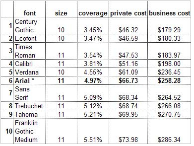
I wrote a post last October in which I compared the "ink economy" of Ecofont with some standards, and a new extra-light font. Now printer.com has done an actual study using printers with different default typefaces and face sizes, as reported by CNet.

Their results shown here indicate that Century Gothic just outdoes Ecofont. However, the effective face width differs for different fonts.

For example, while a sample of Verdana may cover 4.55% of the paper, where the same text in Arial covers 4.97%, if the two are printed at the same face size, the Verdana sample will take up more total horizontal space than the Arial sample (I am assuming the baseline-to-baseline distance is set the same for the two faces). Thus, a large work such as a book chapter might require more pages in Verdana, at the same face size. A slightly smaller percentage of a larger number of pages might or might not actually save something.

It will take some fooling around to determine to what extent this latter factor might change the economic figures shown here. Don't hold your breath, but I expect that printing a book using 10pt Verdana will cost a bit more, using more pages and more ink, than printing it using Arial. Then again, I wouldn't print a book in a Sans Serif typeface, I'd use Times New Roman, which is more economical than Verdana or Arial, on both counts.

Tuesday, October 20, 2009

Fonts and ink

kw: observations, typography, fonts, efficiency

I heard about this unique ink-saving font from a friend. As you can see, it preserves a "heavy" outline, based on the font Vera Sans, but uses "holes" to remove about 20% of the ink that would ordinarily be used to print. It is found here. At the moment, it has only a Regular version (at least in the free download), so converting a page to print using it will lose any bolding or italic emphasis.

That got me thinking. I've been collecting selected free fonts for years, so I looked through my archives. There are other ways of using less ink while maintaining a good, readable look.

While Verdana is heavily used for web pages, the slightly lighter Arial is used in many, many Windows documents for printing. It is the default in Microsoft Excel and in many PowerPoint templates, for example. However, it is still a bit of a heavyweight, with a large x-height and thick strokes.

I chose the letters e, t, and a to display because together they represent 30% of all letters used in English text. If you consider punctuation, the total proportion drops a couple of points. The caps are shown below the uncials to illustrate the normal leading (or ledding), the extra space added between the topmost ascender and lowermost descender. When Arial is used at 12 point size, default leading is 14.5 points from baseline to baseline.

Because of kerning, and variations from typeface to typeface in spacing standards, the measurements I report below are based on the ink width of the letters and include no between-letter spaces.

Times New Roman, the default font in Microsoft Word, is probably used the most. I once read that 90% if all keystrokes on all desktop computers go into word-processed documents.

The weighted strokes, with various amounts of each letter composed of hairlines, makes TNR a more ink-efficient font than Arial. In a moment, we'll see by how much.

The leading of TNR and Arial are the same, 14.5 points for 12-point type size. By the way, if you want to save paper also on a longer document, you can change the leading to 12 points, meaning that the descender on a "y" could potentially just touch the top of the "A". This is called Solid Setting. I haven't looked into it in detail, but there may be extra space built into the font definition to keep even solid set type from such "collisions".

Years ago I bought a four-face family named Zapf Humanist 601 BT. It has the kind of weighting that TNR uses, but is sans serif, so no ink is used making the little serifs on certain letters. I like it because it is, to me, the most beautiful of the sans serif fonts. At this size, you can see some of the styling and shaping of the strokes.

Whether by chance or by design, it has the same leading as both TNR and Arial. Just by looking at it, one may see that it will use less ink on a printed page than Arial.

This is the only font I've paid for. All others I look for in freeware sites. Similar fonts that are free include (names only, no links; you can look them up) Optimum and Optane. There is a free version of Optima out there also; it is the one the Zapf font is based on, but be careful. Bitstream sells their own version of Optima, and pirated copies abound.

A better comparison of the "e" glyphs from these three fonts can be seen on this gridded image. I digitized these glyphs to determine their ink loading percentages. This is the amount covered by the glyph divided by the rectangle defined by the the baseline-to-baseline distance at normal leading, and the ink-to-ink width of the glyph:
  • Arial = 22%
  • TNR = 16%
  • Zapf = 14.5%
The Zapf font uses (comparing percents to percents here; don't get lost) 66% of the ink that Arial does, and 91% of the ink that TNR uses. TNR uses 73% of the ink that Arial does. Some of this efficiency comes from smaller x-height, but much also comes from the more slender average strokes.

The same analysis for the "t" glyphs shows:
  • Arial = 25%
  • TNR = 17%
  • Zapf = 16%
The Zapf amounts for the "t" glyphs are 73% compared to Arial and 94% compared to TNR, while TNR uses 77% of the ink that Arial does.

The similarity of these figures indicates that the two weighted fonts are well balanced. Their look on the page is the best confirmation of this.

Now, there is yet another way to use less ink. Use the next smaller type size. One company I worked for, before issuing Microsoft Office software, had the default text size in MS Word changed from 12 point to 11 point. There is little visible difference on a printed page, to the eye, but the smaller size uses 84% as much ink. That alone is a 16% saving.

If you want a really thin, ink-efficient font, try this one. It is mid-page at fontspace.com's thin category. I have done no metrics on it, but it clearly will use very little ink. The problem is, there are no (as yet) italic and italic-bold versions, though there is a boldface that is still quite light.

If a body is determined to save printer ink or toner, perhaps some of these ideas will help.