Showing posts with label comparisons. Show all posts

Thursday, January 16, 2025

Compliance among Auto Art programs

 kw: ai experiments, simulated intelligence, automatic art, comparisons, generated art

I like caves. In the post Troglodyte Fantasy I reported on a project to generate images of about a dozen rooms built into cave spaces, using two different art generators. I experimented with several others, and I conclude that the various programs vary significantly in how much they conform to or comply with the details of a prompt. I used long prompts in particular for this project. Here is the first one, which was intended to reify my ideas for a "man cave":

A room in a spectacular cave that has many stalactites and stalagmites, with flowstone on the room's walls, fitted out as an office with a desk and chair and desk lamp and two large computer monitors, with a bookshelf full of books to one side and two smaller side chairs.

Note that the room inventory is one desk, one desk chair, two side chairs, a desk lamp, two computer monitors, and one bookshelf. The milieu is a cave as described.

So far, I have produced images for all the rooms using three programs: Leonardo AI, ImageFX, and most recently DreamStudio. I also produced several versions of the Cave Office image using Gemini, Dall-E3, and Playground. The degree of prompt compliance these programs exhibit is quite variable, both from program to program and within the various "styles" or other toolsets of a program. I show some findings below, first for the four programs that I managed to "persuade" to hit nearly all the goals. Here is an image montage:


DE3: Dall-E3 – Everything is there, plus an extra bookshelf and several extra lamps in addition to a tiny desk lamp. We also see a view outside the cave through an archway.

DS: DreamStudio – There is only one side chair. There is a bonus monitor and floor lamp. However, it took the production of dozens of images to get this one.

GEM: Gemini – No side chairs, but everything else is there. The desk lamp is off, and the cave in general is the darkest one of these four. This was cropped from a square image.

IFX: ImageFX – Everything is there, plus an extra bookshelf and extra desk lamp. I understand that both Gemini and ImageFX use Imagen 3 to generate images, but there must be different training sets in the background.

The other two programs have numerous "style" settings, so in the second montage I showcase two variations for each program:


Leo: Leonardo AI. On the left, style and substyle "Phoenix" and "illustration", which explains the drawn appearance. Everything is there, although the two lamps stand beside rather than on the desk, so there is no real desk lamp. I am not sure what the green tree in the corner is doing there! "Phoenix" is billed as being extra-compliant to prompts. 

On the right, style and substyle "Lightning" and "vibrant", so color and contrast are enhanced. It's hard to see where a second monitor might be. Everything else is there, with added chairs and tables and table lamps, like a mini-conference sidebar. Note that Leonardo AI has various levels of credit usage for different styles, and Phoenix costs 2.4 times Lightning, while most other styles cost 1.4 times Lightning, which is promoted as fast and cheap.

PG: Playground. On the left, using the SDXL (Stable Diffusion XL) engine, probably version 1.0. There is only one side chair, but an extra bookshelf opposite, and a smaller bookshelf at the far end of the room.

On the right, using the PG30 (Playground 3.0) engine, which is billed as "very compliant to prompts". That is apparent here. Everything is there, with nothing extra. Sadly, Playground has dropped its image generation interface and announced it is going into graphic design. I'll miss it. It had the most options, but a big learning curve.

This doesn't get very deep into the use of these programs. At present the only program I have paid into is DreamStudio, because they have a pay-as-you-go plan, similar to the one Dall-E2 had. The others have various subscription plans, which I avoid. I haven't tried editing or outpainting with any of these except Playground. 

It is likely I could edit an image to add something I think is missing. But I prefer to get an image that is closer to what I want from the start, so little or no editing is needed. In the past I used outpainting to turn a square image into a wide-format image. That is not needed now, except for Gemini, but when asked for "wide format" it produces an image a little zoomed out so you can crop it, and its original images are 2048x2048, which helps.

Thursday, November 28, 2024

Art generators don't know physics

 kw: generated art, scientific errors, comparisons, stock image websites

Reading a book of science for a popular audience, in a section about the use of spectroscopy to learn the compositions of stars, I encountered this illustration. Can you see what is (dramatically!) wrong with it?

The principle of refraction is this: when light enters a transparent material, such as glass, from the air, at an angle, it is bent closer to a line perpendicular to the material's surface. That means that the beam of white light entering from the left, should be refracted into a narrow spectrum that proceeds down and to the right. Then, when it encounters the other side of the prism, which is at a different angle, it will be bent downward again. 

Here, the first refraction is in the wrong direction. That implies that the glass prism has a refractive index less than 1, which is impossible. But the second refraction has the correct sense, which just adds confusion. This illustration is from Getty Images, a source of much stock artwork and photography. The author of the book in which I saw this image must not have been paying attention.

This is a more accurate illustration; it is from Britannica online. It shows the refraction angles correctly. One small matter is not accurate: Real prisms produce a spectrum with a dispersion angle of less than one degree. This illustration shows the spectrum, at the right, spreading across fifteen degrees. This is OK for the sake of illustration.

I got curious about such illustrations, and investigated a bit. First, I entered the prompt "prism spectrum" in Google Images. I looked through a few hundred images. There were all kinds of results. More than half of them were somewhere between wrong and incredibly wrong!

Not only Getty Images had it wrong; the following sites were consistently wrong or worse:

  • Shutterstock
  • DepositPhotos
  • Pixers
  • Freepix
  • Pugtree
  • Big Stock

The following had it right some of the time:

  • Adobe Stock
  • iStock
  • Vector Stock
  • KaiserScience

Finally, these sites had no errors that I found:

  • Britannica
  • Cyberphysics
  • CK12-Foundation
  • Dreamstime
  • Australia Telescope National Facility
  • LabXChange
  • Science Photo Gallery
  • Hyperphysics
  • Urban Pro

Many of the images had the look of generated artwork. So I put various prompts in four image generation products. After much experimentation with the text, the prompt used for these images was

A triangular prism in the center, a narrow light beam from the lower left upwards to halfway up the left side of the prism, continuing as a narrow spectrum across the middle inside the prism, and exiting the prism to descend toward the lower right as a wider spectrum.

Here are the best of each:

Even with very explicit instructions as to the direction of each section of the light beam, these are the best among numerous offerings that were pretty, but nonsensical. None came close.

One would think, among the billions of images used to train these programs, there would be some accurate scientific diagrams. However, spectroscopy is a "small market" in the scientific arena. If an author wants good scientific illustrations, it's still, not just "best", but imperative to use a human graphic artist, and to examine the results with a critical scientific eye.

Saturday, March 09, 2024

Guidance Parameter in Playground AI

 kw: experiments, ai art, generated art, artificial intelligence, simulated intelligence, comparisons, photo essays

Another parameter to explore in Playground AI is Guidance. This influences how closely the generated image conforms to the prompt, so they say. I decided to find out. In earlier experiments I had kept a few images I particularly liked. One had the seed 260650348, and I decided to use that for this experimental project, and to use only the Euler a Sampler.

The three Models have very different sets of Guidance parameters:

  • Stable Diffusion XL (SDXL) has levels from 0 to 30, and Guidance above 30 is available to subscribing (paying) users. The default is 7 and in FAQ's they recommend primarily using between 7 & 10. After some pre-work I decided to use 2, 4, 7, 11, 16, 24, and 30.
  • Playground v2 (PGv2) has levels from 0 to 5. The default is 3. I determined that levels 0, 1, and 2 produce identical results, so I decided to use levels 2, 3, 4, and 5.
  • Playground v2.5 (PG25) doesn't use a Guidance parameter. It also doesn't have multiple Samplers. It's a "point and shoot" generator.

I've learned from others' reviews and some "help" YouTube videos that longer prompts give the software more to work with. It stands to reason that there could be a greater difference among Guidance levels with a long prompt, compared to a short one. I decided to test four prompts of a wide range of lengths; the word counts below are "meaningful" words, ignoring articles:

  1. 1 word: Cosmology
  2. 5 words: Quaint village near a mountain stream
  3. 13 words: A rocky beach grading into a sandy beach below sea cliffs beneath a partly cloudy sky
  4. 28 words: Fantastical clock with a big dial for the time using roman numerals, the second hand on a small dial of its own, and indicators for month and day and phases of the moon

I'll present the resulting images half size (512x512) in pairs or groups of 4, beginning with PGv2 and Prompt 1.


A number of trends are seen as Guidance (G from now on) goes from 2 to 5:

  • The sky arch begins with a look like a multiverse, and goes to more of a dynamic universe look.
  • The observer is bigger at G4 and 5, while the child seen at G2 turns to a rock which progressively shrinks.
  • Trees appear at G3 and move around.
  • The nebula of G2 gradually turns into a galaxy.
  • Sundry planets come and go.

However, there is no dramatic change in the overall look of the image.

Next, 7 images from SDXL, plus one by PG25.


The SDXL images all have a Medieval look to them. The two that look best are the third and fourth, with G07 and G11. Above G16 they kind of go off the rails. At G30 in particular the frame is quite detailed, but the rest of the image has lower quality, as the FAQ warned. The PG25 image is quite fetching, similar to the central portion of the PGv2 images, with a kind of swirly surround. This one could be fun to run a bunch of with random Seed turned on.

Now for Prompt 2, the village by a stream. PGv2 first:


As before, these are all very similar, with added details at each increased G level. Next, SDXL and PG25.


The frame seen in the earlier series is still with us. Here, the overall look gets a dramatic overhaul after G11. The image for G16 has a bookplate look, while G24 and G30 seem to emanate from confusion, perhaps due to conflicting requirements.

The PG25 image is very pleasing, similar to any of the four PGv2 images, but more detailed and dramatic. Next, the beach scene, PGv2 first.


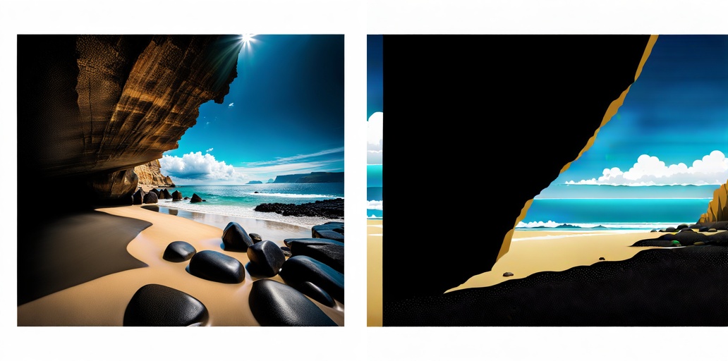
The differences between these are a matter of increasing detail. I note that the main cliff attains an overhang in the fourth image, and while it looks like the sun is higher, it's just that the second headland is lower, with a notch in it. Now for SDXL and PG25.


I see that these retain the frame. The first two images, at G02 and G04, are from a high perspective; it would have taken more words to specify where eye level is. The next one, G07, is about what I had in mind. The fourth image, at G11, is very good and G16 is almost as good, if a little exaggerated. After that things go downhill, and the frame is even breached.

PG25 has a very good look, with more diverse scenery than the PGv2 images. Now for the final series, the clock, beginning with PGv2.


I had something in mind when I wrote Prompt 4, which I'll get into below. Only the fourth image, with G5, appears as if it could be a real clock. All four of these have the "smaller dial for the second hand" concentric with the main dial. That's not what I had in mind, but I didn't specify "next to" or "below" the main dial. Now for SDXL and PG25.


It's pretty clear by now that, however many words one uses, the best range is usually from G07 to G16. The first two images are rather primitive, and the last two go wonky. I suppose the best is at G07.

PG25 has produced an entire clock, not just a dial in a frame. It still doesn't meet all the criteria. 

Here is what I had in mind, a clock with a moon dial and a separate second hand dial above the center. The day indicator is in the square window; numerous variations on showing days have been produced. This is a modern dial, in a style going back 150 years.


Had I specified "many dials" I might have expected something more like this, a French clock from the Louis XIV era. The "dial" at the top signals a speed control, typically adjusted for the seasons as temperature affected the length of the pendulum.

This last image is from a clock tower in Belgium. Clearly, the AI interpretation of "fantastical clock" is still somewhat limited.


Monday, March 04, 2024

The new artist on the block

 kw: ai art, generated art, artificial intelligence, simulated intelligence, comparisons, photo essays

A year and a half ago I began to use Dall-E2 as my "hired painter". A favorite pastime has been generating landscapes, particularly for use as Zoom backgrounds. This image is one I have used a lot:


The prompt for this was "A calming forest scene with wildflowers in a meadow, a stream, and a small pond, landscape painting." I don't recall how many times I ran the prompt, probably no more than twice, before I saw a 1024x1024 pixel square I liked, shown here. Then I outpainted (extended) it. The images Dall-E2 produces are PNG files, which are 5-7 times as large as a JPG saved with a 95% quality factor.

The result is 2624x1472 px, including the color bar used by Dall-E to identify its products. I cropped out a 2572x1447 portion, which is very close to the 16:9 aspect ratio needed for HD wallpaper. (As with any Blogger image, you can click on these to see them full size. The first image was reduced by about half from the original.)

Just a few days ago I got a notice from Bard, Google's version of ChatGPT, that its name was being changed to Gemini, and that it could now generate images. In the past few months I got access to a free version of Dall-E3 through Bing, and discovered another AI image program called Playground, that I've written about recently.

When I started to use Dall-E2 in 2022 I also tested the other two "legacy" AI art generators, MidJourney and Stable Diffusion. I found them more limited than DE2, and they are more expensive to use, so I ignored them since then. I recently took another look at MidJourney, but it runs as a Discord service, and I find Discord hard to use; it's also still too expensive. I'll mention more about Stable Diffusion in a moment.

I decided to test the products that I do use on the same prompt. Later I added another prompt, and we'll come to that.

First, I ran the "calming forest scene" prompt with Dall-E3 a few times, and picked the square shown here as the one most pleasing to me. DE3 doesn't yet do outpainting (at least not in the free version). Where the free version of Dall-E2 allows 15 free "Generate" steps per month, the free Bing version of Dall-E3 allows 15 per day. Running a prompt in Dall-E3 yields four square JPG images.

It is immediately clear that this image is more detailed, while retaining the look of a painting. Also, there is no color block or other "signature".

Both versions of Dall-E adhere pretty well to the prompt. Shorter prompts result in more variety. Prompt construction and editing become tools to negotiate with the product to get an image you want.

Secondly, I ran that prompt with Gemini. Since Gemini is also a chatbot, one must say, "Create a calming forest scene…", for example. You can ask Gemini for more suggestions, and get its help producing a prompt. Gemini also can produce four results per prompt, but sometimes it gives only two or three. At the moment, you cannot ask for human figures to be included; Google got in trouble when its early release of Gemini images yielded nearly all "minority" (non-Caucasian) faces.

The default size of Gemini images is 1536x1536, and they are JPG files. I reduced this one to 1024x1024 to compare with the other programs.

The level of detail is between that seen for Dall-E2 and Dall-E3. There is also a painterly look. I haven't tried asking for photographic detail.

Gemini claims that you can ask it to produce images of other sizes, between 256x256 to 1536x1536, and other ratios, such as 1024x576 (an HD ratio), but when I included size instructions in the prompt, I still always received 1536x1536 squares. Queried about this, Gemini said the capability was not yet there. I'd love to be able to produce 1920x1080 images from the get-go, but that has to wait.

Now, with Playground there are complications. Playground has a "side version" called Playground.AI that can produce images that are 1920x1080 and a wide variety of other sizes, but after doing about 20 prompts, a countdown reaches zero and you need to subscribe. I haven't seen whether more images become available after a month or whatever; I had other issues so I stopped using it. The "big version" at playgroundai.com has so many controls and options that it is hard to pick a single "default". For example, there are presently three Models, Stable Diffusion XL (they once included Stable Diffusion 1.5, but have dropped it), Playground v2, and Playground v2.5; there are also Samplers, which are mathematical methods used for the Diffusion operation, as many as 12 in the paid version and 8 in the free version; and there are dozens of Filters that affect the look of an image in ways ranging from subtle to dramatic; you can also turn on or off the random number generator used to produce a different Seed for each image. 

To simplify things for this experiment I let the Seed be random, I didn't use any Filters, and I used the following setups to produce five images, selected from groups of four under these conditions:

  1. SDXL (Stable Diffusion XL) with DPM2 Sampler
  2. SDXL with Euler a Sampler (Euler a is the default when you start to use Playground)
  3. PGv2 (Playground v2) with DPM2 Sampler
  4. PGv2 with Euler a Sampler
  5. PG25 (Playground v2.5), which doesn't use an explicit Sampler (of course there is a Sampler buried inside somewhere)

SDXL with DPM2. This and the following four images have quality and detail equal to DE3. This has a brighter look overall, including a little drama in the sky. I'll compare its siblings below with it.
SDXL with Euler a. Euler a in general has a softer look than DPM2.
PGv2 with DPM2. This is even brighter than SDXL, even a bit edgy, though the sky is more bland. I like the misty aspect of the background for all these, but this one is more pronounced.
PGv2 with Euler a. A little softer, as before, but this one also has a better sky.
PG25. This is even brighter than the others, almost too bright. All these five have a greater aesthetic quality than DE2 and Gemini, while matching DE3 in aesthetics though having a rather different feel.


They are all beautiful. But we are only half done here. All these art generators have the characteristic that they produce more widely diverse images when given very short prompts. Diverse not only from one product to the next, but from one image to the next in any product.

I happened to be reading a book about simulations in cosmology, so I decided to use a one word prompt: "Cosmology". This time I ran the prompt twice with each product. Here, for each product and variation I'll show all four responses to each issuance of the prompt. Dall-E2 is first:


These are screen shots of the image sets Dall-E2 produced. There's lots of variety from image to image, not just of subject matter but of style. Most of these have a focus, planets, galaxies, etc. The last image, at lower right, seems to have a wider scope, and most closely evokes "cosmology".

The next two sets of four are from Dall-E3, which displays its results in a block rather than a line, and with a black background:


Here, each set of four has a common theme, but the theme varies, as does the style, from one set to the next. Both sets have a galactic focus, but in the first set, two appear to host quasars.

Next is Gemini.


The first set is similar in concept to Dall-E2, with greater diversity. Its first image seems to best encapsulate "cosmology", having great scope. For the second set, Gemini produced only three images, all similar. One may click "Generate more", which I did, and it came up with two more images, one of which is shown here. The one not shown is different from all the others.

Now we turn to Playground, which produces groups up to four in a line. First, SDXL with DPM2 Sampler:


Six of these echo historical, pre-Enlightenment era, concepts of the Universe, in sundry ways. I'd say that the first image in the first set best illustrates the prompt. It seems to segue from Earth to infinity. Only the second image in the second set includes something vaguely like a galaxy.

Switching to the Euler a Sampler produced these:


Five of these bear some resemblance to the six "historical" images above, but the allover feel of these is different. None of these really fit the scope of the prompt.

Next we'll see PGv2 with the DPM2 Sampler:


These have less overall variety. The last image of the eight seems to go the farthest "out there". It's curious that PGv2 put people in nearly every image.

Now for the switch to the Euler a Sampler:


Wow! The first of the images would make a great bookplate. The rest are similar to the sets with the DPM2 Sampler, with the same tendency to include a person, if not persons. The third image in the second set is the closest of these eight to the "cosmology" concept, as I envision it.

Finally, let's see what PG25 does:


I still see a person or two, but all of these better approach the prompt in concept, with the eighth perhaps being the best. It is interesting that, with the one exception noted above, the images produced by Playground don't show things that look like galaxies. 

I see this collections of images as a catalog of "looks" I can refer to when choosing the way I want a generated image to appear. It is evident that Playground has the greatest variety of ways it can respond to a prompt, but that each of the other three art engines has something unique to offer.