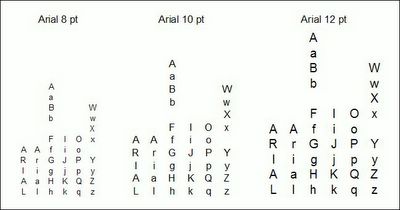
I often use vertical titles on narrow columns. The image below shows how Arial looks when arranged vertically. The image in the following post shows a new font I produced to make vertical titles that look better (to me at least) and takes less space. I began with an existing Sans Serif font that has a large "x" size, then removed nearly all the ledding and centered the lower case. The only letter I had to adjust was the "j".
Vertical Text in Excel using Arial Font


No comments:
Post a Comment