kw: experiments, ai art, generated art, artificial intelligence, simulated intelligence, comparisons, photo essays
Another parameter to explore in Playground AI is Guidance. This influences how closely the generated image conforms to the prompt, so they say. I decided to find out. In earlier experiments I had kept a few images I particularly liked. One had the seed 260650348, and I decided to use that for this experimental project, and to use only the Euler a Sampler.
The three Models have very different sets of Guidance parameters:
- Stable Diffusion XL (SDXL) has levels from 0 to 30, and Guidance above 30 is available to subscribing (paying) users. The default is 7 and in FAQ's they recommend primarily using between 7 & 10. After some pre-work I decided to use 2, 4, 7, 11, 16, 24, and 30.
- Playground v2 (PGv2) has levels from 0 to 5. The default is 3. I determined that levels 0, 1, and 2 produce identical results, so I decided to use levels 2, 3, 4, and 5.
- Playground v2.5 (PG25) doesn't use a Guidance parameter. It also doesn't have multiple Samplers. It's a "point and shoot" generator.
I've learned from others' reviews and some "help" YouTube videos that longer prompts give the software more to work with. It stands to reason that there could be a greater difference among Guidance levels with a long prompt, compared to a short one. I decided to test four prompts of a wide range of lengths; the word counts below are "meaningful" words, ignoring articles:
- 1 word: Cosmology
- 5 words: Quaint village near a mountain stream
- 13 words: A rocky beach grading into a sandy beach below sea cliffs beneath a partly cloudy sky
- 28 words: Fantastical clock with a big dial for the time using roman numerals, the second hand on a small dial of its own, and indicators for month and day and phases of the moon
I'll present the resulting images half size (512x512) in pairs or groups of 4, beginning with PGv2 and Prompt 1.
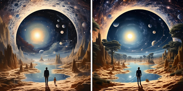
A number of trends are seen as Guidance (G from now on) goes from 2 to 5:
- The sky arch begins with a look like a multiverse, and goes to more of a dynamic universe look.
- The observer is bigger at G4 and 5, while the child seen at G2 turns to a rock which progressively shrinks.
- Trees appear at G3 and move around.
- The nebula of G2 gradually turns into a galaxy.
- Sundry planets come and go.
However, there is no dramatic change in the overall look of the image.
Next, 7 images from SDXL, plus one by PG25.
The SDXL images all have a Medieval look to them. The two that look best are the third and fourth, with G07 and G11. Above G16 they kind of go off the rails. At G30 in particular the frame is quite detailed, but the rest of the image has lower quality, as the FAQ warned. The PG25 image is quite fetching, similar to the central portion of the PGv2 images, with a kind of swirly surround. This one could be fun to run a bunch of with random Seed turned on.
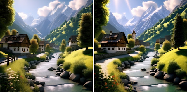
Now for Prompt 2, the village by a stream. PGv2 first:
As before, these are all very similar, with added details at each increased G level. Next, SDXL and PG25.
The frame seen in the earlier series is still with us. Here, the overall look gets a dramatic overhaul after G11. The image for G16 has a bookplate look, while G24 and G30 seem to emanate from confusion, perhaps due to conflicting requirements.
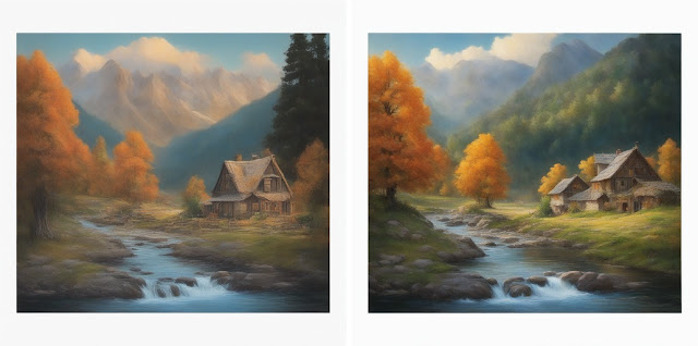
The PG25 image is very pleasing, similar to any of the four PGv2 images, but more detailed and dramatic. Next, the beach scene, PGv2 first.
The differences between these are a matter of increasing detail. I note that the main cliff attains an overhang in the fourth image, and while it looks like the sun is higher, it's just that the second headland is lower, with a notch in it. Now for SDXL and PG25.
I see that these retain the frame. The first two images, at G02 and G04, are from a high perspective; it would have taken more words to specify where eye level is. The next one, G07, is about what I had in mind. The fourth image, at G11, is very good and G16 is almost as good, if a little exaggerated. After that things go downhill, and the frame is even breached.
PG25 has a very good look, with more diverse scenery than the PGv2 images. Now for the final series, the clock, beginning with PGv2.
I had something in mind when I wrote Prompt 4, which I'll get into below. Only the fourth image, with G5, appears as if it could be a real clock. All four of these have the "smaller dial for the second hand" concentric with the main dial. That's not what I had in mind, but I didn't specify "next to" or "below" the main dial. Now for SDXL and PG25.
It's pretty clear by now that, however many words one uses, the best range is usually from G07 to G16. The first two images are rather primitive, and the last two go wonky. I suppose the best is at G07.
PG25 has produced an entire clock, not just a dial in a frame. It still doesn't meet all the criteria.
Here is what I had in mind, a clock with a moon dial and a separate second hand dial above the center. The day indicator is in the square window; numerous variations on showing days have been produced. This is a modern dial, in a style going back 150 years.Had I specified "many dials" I might have expected something more like this, a French clock from the Louis XIV era. The "dial" at the top signals a speed control, typically adjusted for the seasons as temperature affected the length of the pendulum.This last image is from a clock tower in Belgium. Clearly, the AI interpretation of "fantastical clock" is still somewhat limited.


No comments:
Post a Comment